The Marketing KPI Dashboard: What to Actually Put On It

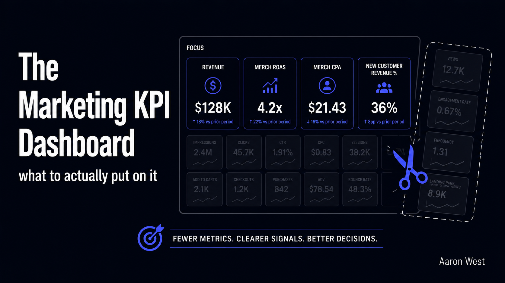
Table of Contents
A good marketing dashboard is not the one with the most numbers on it. It is the one that answers a single question fast: what should I do next? Most dashboards fail this test. They are crowded with every metric the tools can produce, impressions, clicks, followers, sessions, dozens of figures that feel like rigour but change no decision. The result is a screen people glance at, feel vaguely informed by, and act on not at all. A dashboard that does not change a decision is not a dashboard. It is wallpaper made of numbers.
This is the reporting piece in the performance marketing pillar, and it sits on top of everything else in it: once you understand the metrics, the tracking, and what attribution can and cannot tell you, the question becomes which of all those numbers actually deserve a place in front of you, and how to arrange them so they drive action. I will cover the principle that should decide what goes on the dashboard, the structure that makes a dashboard usable, the small core set of metrics most e-commerce businesses actually need, and the trap that turns even a good dashboard into decoration. (There is a separate affiliate-programme-KPI piece for that channel's specific numbers; this is the general marketing view.)
The principle: every metric must earn its place by changing a decision
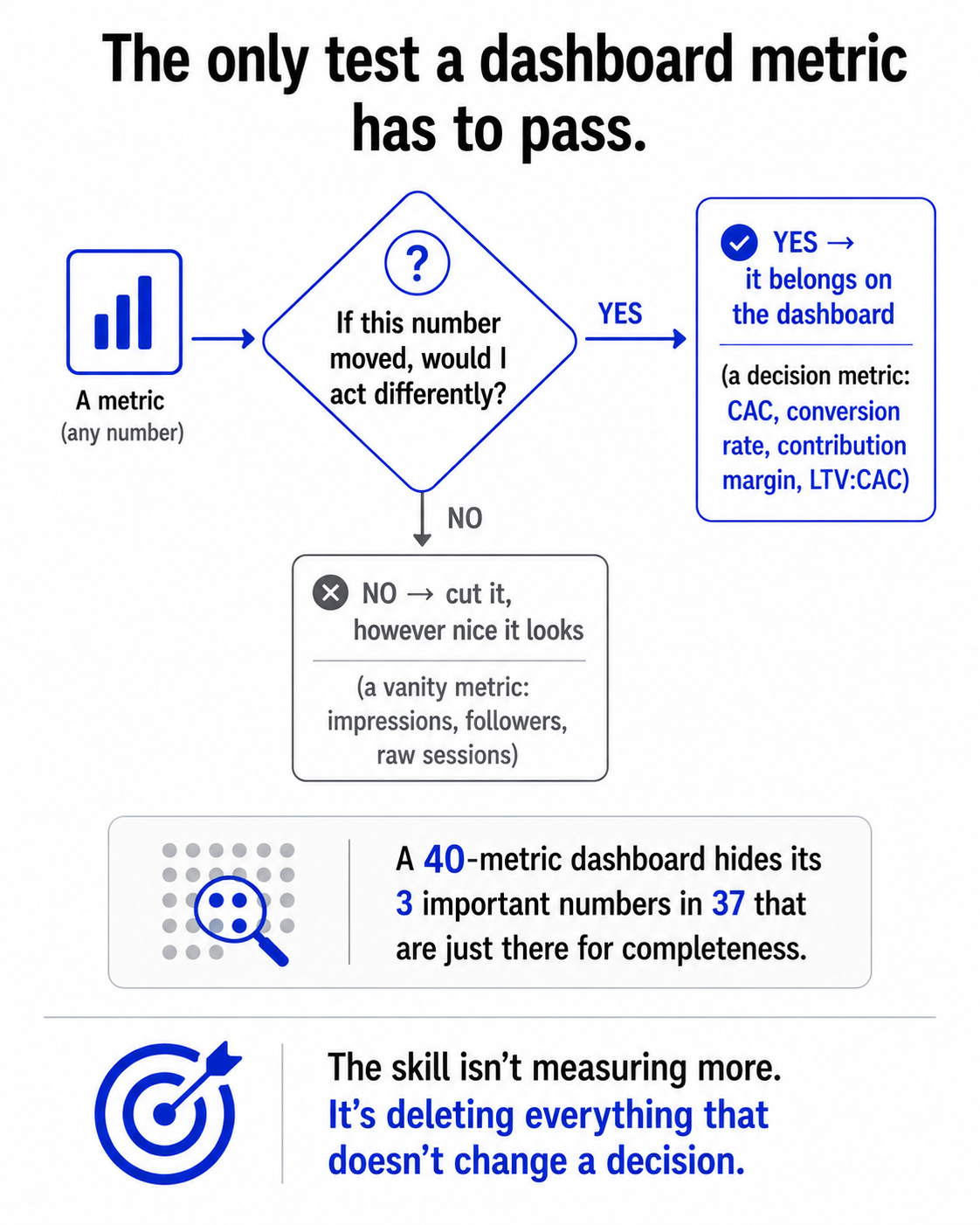
Start with the rule that should govern the whole dashboard: a metric belongs on it only if a change in that number would change what you do. That is the entire filter. If your follower count doubles and you would do nothing differently, follower count does not belong on the dashboard. If your cost-per-acquisition climbs and you would shift budget, pause a campaign, or investigate, then cost-per-acquisition earns its place. The question is never "can we measure this?" Almost everything can be measured now. The question is "will this number make us act?"
This sounds obvious and is almost universally ignored, because adding a metric feels productive and removing one feels like losing information. But every number you add dilutes the ones that matter. A dashboard with forty metrics hides its three important ones in a crowd of thirty-seven that are just there for completeness. Discipline here is subtractive: the skill is not finding more to measure, it is ruthlessly cutting everything that does not drive a decision, until what remains is small enough that each number gets actual attention. Five to seven well-chosen KPIs, tied to your stage and your goals, beat forty every time. The hard part is the deleting.
The structure: organise by decision frequency, not by topic
Most dashboards are organised by source, a Google Ads box, a Meta box, an email box, which mirrors your tools but not your decisions. The more useful structure organises by how often you act on the number, because different metrics drive different rhythms of decision, and forcing them onto one screen makes all of them harder to read.
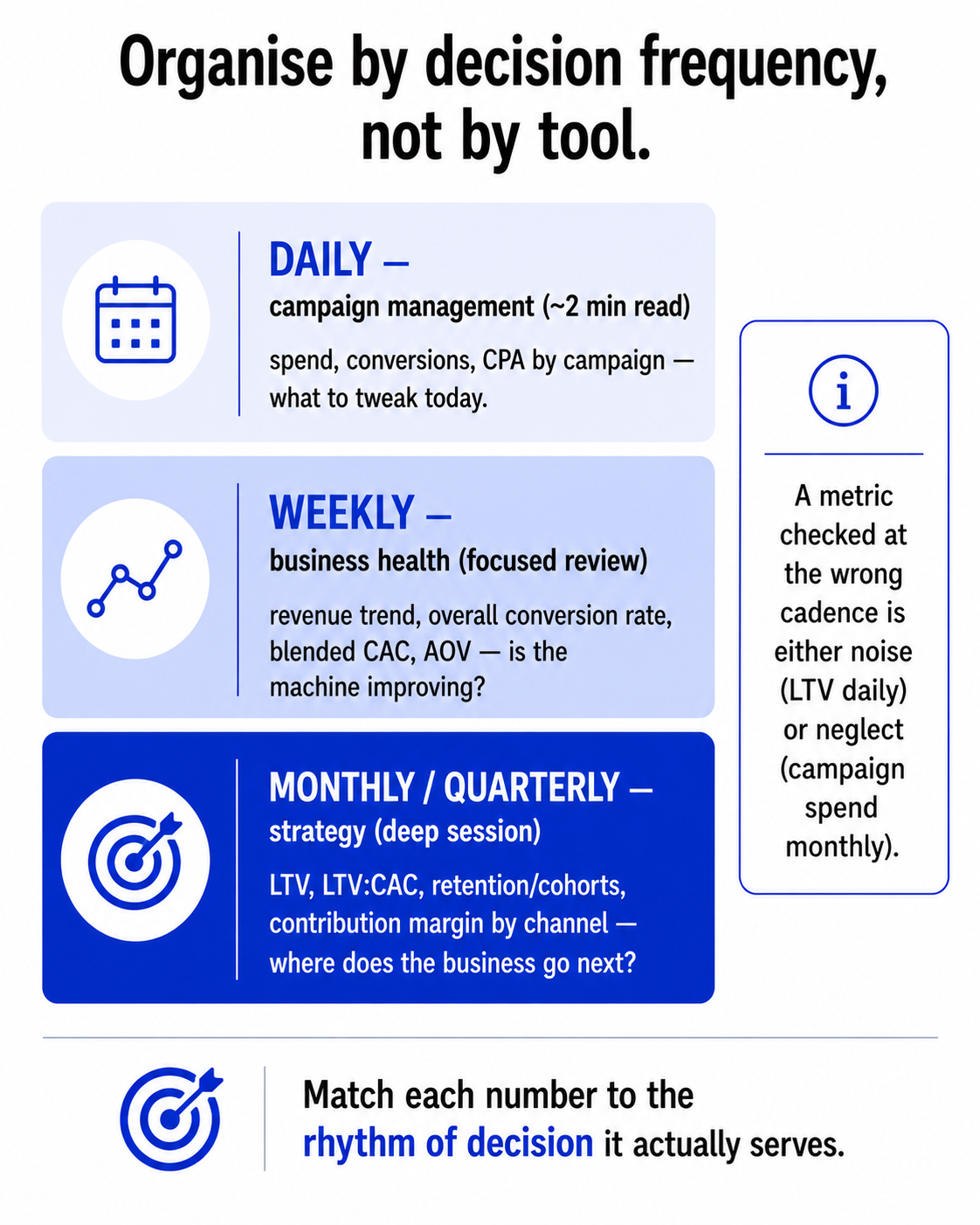
Think in three layers, matched to three cadences:
- The daily view, for campaign management. The fast-moving operational numbers you might act on today: spend, conversions, cost-per-acquisition by campaign, anything you would tweak day to day. This view should take a couple of minutes to read. Its job is to catch problems early and spot what to adjust now.
- The weekly view, for business health. The numbers that tell you how the business itself is doing, not just individual campaigns: revenue trend, overall conversion rate, blended acquisition cost, average order value. You read this to see whether the whole machine is improving or sliding, and it deserves more than a glance, a focused review.
- The monthly (and quarterly) view, for strategy. The slow, deep numbers that drive direction: customer lifetime value, the LTV:CAC ratio, retention and cohort behaviour, contribution margin by channel. These barely move week to week, so checking them daily is noise. You sit with them monthly to decide where the business goes next.
The reason this matters: a metric checked at the wrong cadence is either noise or neglect. Watch lifetime value daily and you will see random wobble and panic over nothing. Glance at today's campaign spend monthly and you will miss a problem that cost you for three weeks. Matching each number to the rhythm of decision it actually serves is what makes a dashboard something you use rather than something you have.
The core set most e-commerce businesses actually need
You can build the three layers from a surprisingly small set of numbers, and resisting the urge to add more is the whole discipline. The metrics that genuinely earn their place for most stores, all defined in the metrics glossary:
- Customer acquisition cost (CAC), ideally blended across all channels, what it actually costs to win a customer.
- Customer lifetime value (LTV) and the LTV:CAC ratio, the single most important measure of whether your growth is sustainable. A widely-cited healthy benchmark is around 3:1, you want a customer to be worth roughly three times what you paid to acquire them. If that ratio is upside down, nothing else on the dashboard matters.
- Conversion rate, the efficiency of turning visitors into buyers.
- Average order value (AOV), how much each order is worth, one of the levers behind revenue.
- Contribution margin, not just revenue or ROAS, because a channel can grow revenue while shrinking profit, and a profit-blind dashboard will cheerfully lead you off a cliff.
Notice what is not on that list: impressions, raw clicks, follower counts, total page views. Not because they are never useful, occasionally they help diagnose something, but because they rarely change a decision on their own, so they do not belong on the dashboard you act from. Revenue growth itself is on the list only with a caveat: track it decomposed into its levers (conversion rate, AOV, and repeat/retention), because "revenue went up" tells you nothing about why, and the why is what you can actually act on. The point of the core set is not that these five or six numbers are magic. It is that they are the ones that, when they move, tell you to do something, which is the only reason a number deserves dashboard space.
The trap: a KPI is a decision trigger, not a number you look at
Here is the failure that undoes even a well-built dashboard, and it is a failure of use, not design: treating KPIs as static numbers to observe rather than triggers that demand action. A dashboard does not improve your business. Acting on it improves your business, and a number you look at, nod, and move on from has done nothing except cost you the time to read it.
So the discipline that completes the dashboard is the part that happens after you look at it. Every KPI worth tracking should have, implicitly or explicitly, a threshold that triggers a response: if CAC rises above this, I investigate. If the LTV:CAC ratio drops below that, I rethink acquisition. If conversion rate falls here, I audit the funnel. Without those triggers, the dashboard is a thermometer nobody acts on, accurate, regularly checked, and completely inert. The related trap is optimising one metric in isolation while damaging another: pushing ROAS up by killing the campaigns that acquire new customers, or chasing conversion rate with discounts that wreck contribution margin. The metrics interact, which is exactly why you watch a small balanced set rather than fixating on one.
Pull it all together and a good dashboard is defined by what it forces you to do, not what it lets you see. It contains only metrics that change decisions, organised by how often you decide, kept small enough that each number gets real attention, and read as a set of triggers rather than a wall of facts. The stores that win are not the ones with the most data. They are the ones that built a clear, consistent, small set of numbers into an actual decision-making habit. Everything else on the screen is just there to make you feel informed, and feeling informed is not the same as knowing what to do next. The dashboard's only job is the second thing.
A few common questions
What metrics should be on a marketing dashboard? Only metrics that would change a decision if they moved. For most e-commerce businesses that's a small core set: customer acquisition cost (CAC), customer lifetime value (LTV) and the LTV:CAC ratio, conversion rate, average order value, and contribution margin (not just revenue or ROAS, because a channel can grow revenue while shrinking profit). Impressions, raw clicks, and follower counts usually don't belong, because they rarely change what you do on their own. Five to seven well-chosen KPIs beat forty.
How should I organise a marketing dashboard? By decision frequency, not by tool. Use three layers: a daily view for campaign management (spend, conversions, CPA by campaign, the fast operational numbers, a two-minute read); a weekly view for business health (revenue trend, overall conversion rate, blended CAC, AOV); and a monthly or quarterly view for strategy (LTV, LTV:CAC, retention/cohorts, contribution margin by channel, the slow numbers that drive direction). A metric checked at the wrong cadence is either noise (lifetime value daily) or neglect (campaign spend monthly).
What is the LTV:CAC ratio and why does it matter? LTV:CAC compares the lifetime value of a customer to what it cost to acquire them, and it's arguably the single most important measure of whether your growth is sustainable. A widely-cited healthy benchmark is around 3:1, a customer worth roughly three times their acquisition cost. If the ratio is upside down (you're paying more to acquire customers than they're worth), no amount of campaign optimisation elsewhere will fix the underlying problem, which is why it belongs in the strategic layer of every dashboard.
Why do most marketing dashboards fail? Two reasons. First, they're crowded with vanity metrics that feel like rigour but change no decision, hiding the few numbers that matter in a wall of ones that don't. Second, and more fundamental, they're treated as numbers to observe rather than triggers that demand action, a KPI without a threshold that prompts a response is a thermometer nobody acts on. A dashboard doesn't improve your business; acting on it does. The fix is a small, decision-frequency-organised set of metrics, each with an implicit "if this moves past here, I do this."
You should also read:
The Cookieless Shift and First-Party Data: What Changed and What to Do
For years the marketing world braced for "the death of the cookie," the moment Chrome would block third-party cookies and the old way of tracking people across the web would collapse. Then in 2025 Google confirmed it was not going to do it after all.
Continue reading...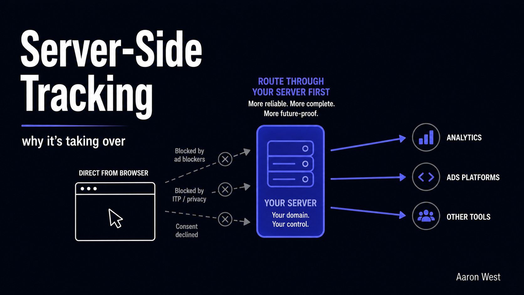
Server-Side Tracking: Why It's Taking Over and What It Means
Server-side tracking moves the job of recording what happens on your site from the visitor's browser to your own server, and that one architectural change is quietly becoming the new standard for serious e-commerce measurement. The reason is simple: the old way, firing tracking tags…
Continue reading...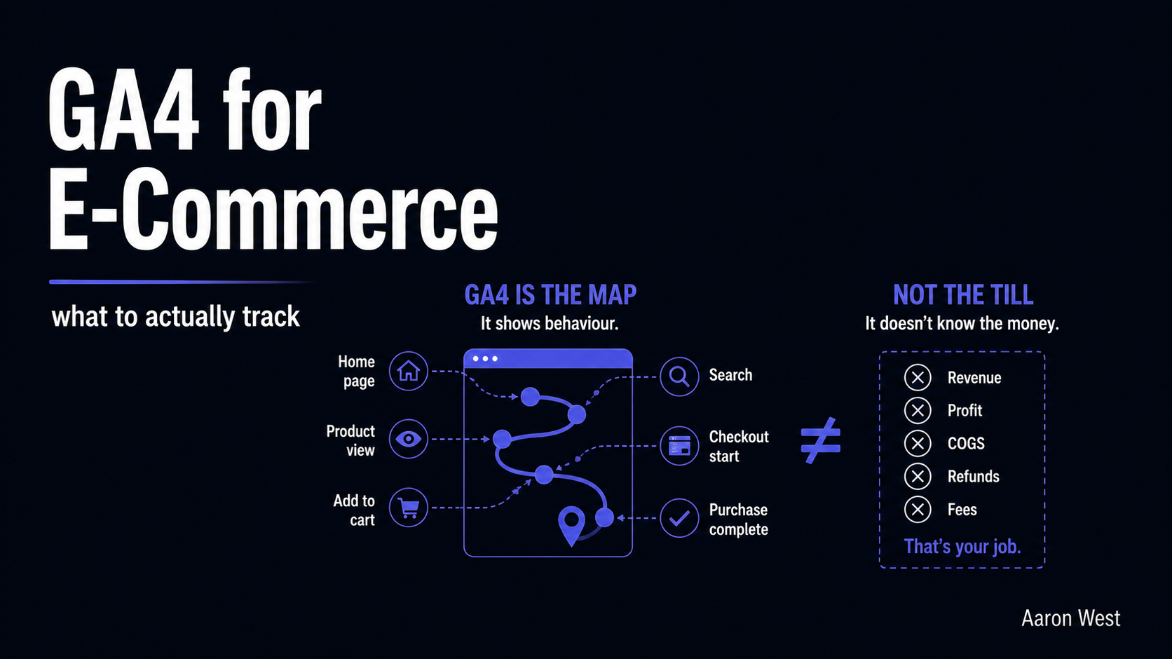
Google Analytics (GA4) for E-Commerce: What to Actually Track
The most important thing to understand about GA4 for e-commerce is also the thing almost nobody is told up front: it is not your sales report, and using it as one will mislead you every time. GA4 is a behaviour tool. It tells you how…
Continue reading...