Trust Is Not a Badge You Add to Your Checkout

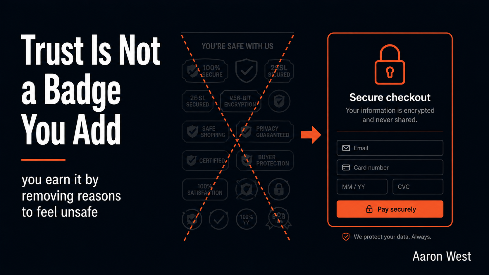
Table of Contents
The moment a customer is about to type in their card number is the most anxious moment in the entire buying journey, and it is where a surprising number of otherwise-willing buyers quietly back out. Around a fifth of shoppers have abandoned a purchase specifically because they did not trust the site with their payment details. That is not a cosmetic concern you sprinkle a padlock icon on at the end. For a real share of your buyers, the question "is it safe to give these people my card?" is the final decision point, and if your store does not answer it convincingly, you lose people who wanted the product, were ready to pay, and got cold feet at the threshold. Trust is a conversion lever, and most stores reach for exactly the wrong tool to pull it.
This is a core piece under my cornerstone on where stores lose the sale, covering the trust-and-security layer that sits underneath the product-page and checkout work. And I want to push back on the standard advice, because the usual answer to "build trust" is "add more security badges," and that is mostly wrong. I will explain why badge-stacking backfires, what actually makes a store feel safe to buy from, where to put reassurance so it works, and why trust is a system rather than a decoration. Plain language, and a slightly contrarian take earned from watching how real people actually decide whether to trust a website.
Why a wall of security badges backfires
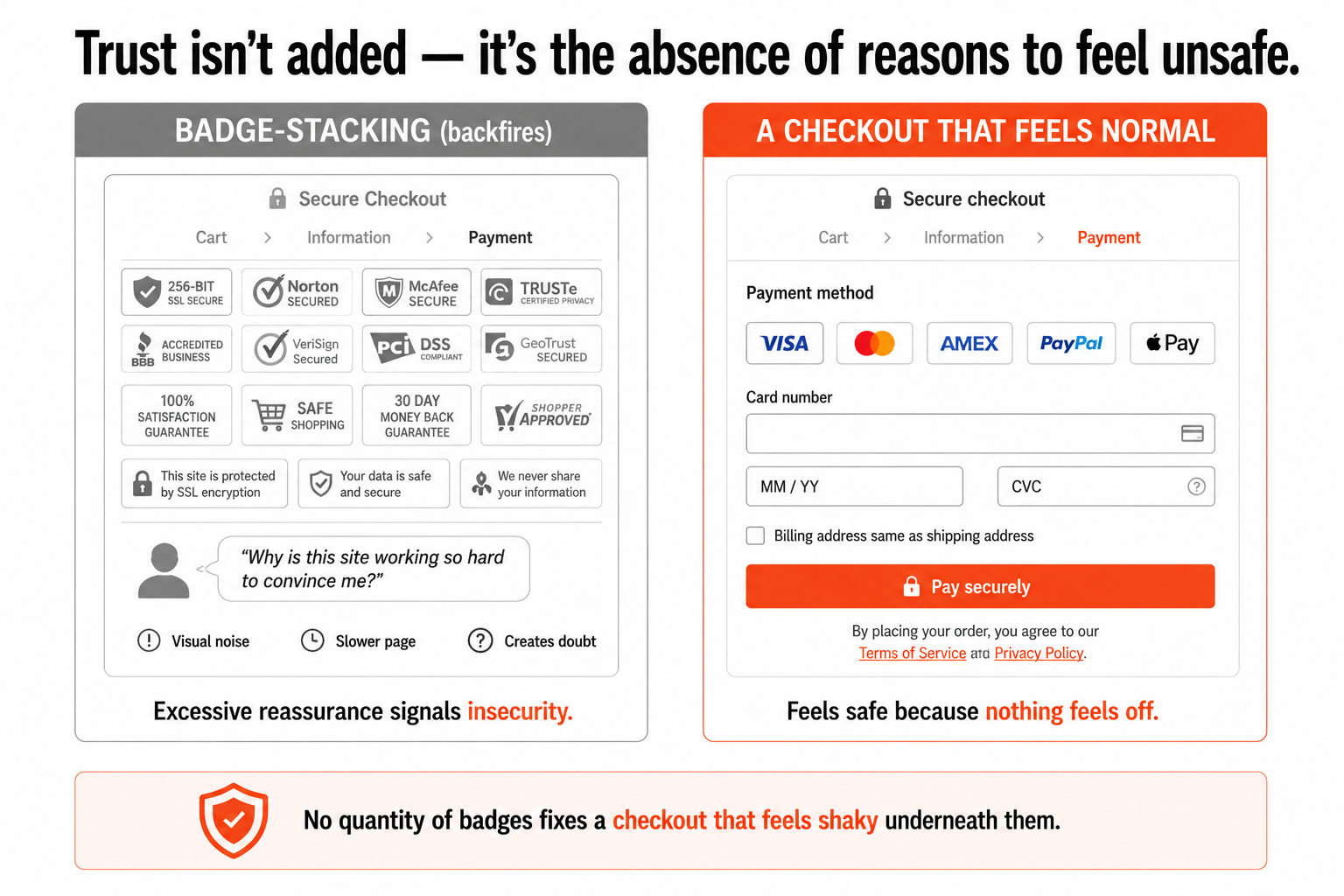
The instinct, when you learn that people abandon over trust, is to plaster the site with security seals: logos on the homepage, badges on the product page, a row of certification icons at checkout, the more the better. It feels like it should work. It usually does not, and it can actively hurt, for a reason that is obvious once you say it out loud: a wall of "TRUST ME, I'M SAFE" badges reads as protesting too much. When a store is covered in security logos, a certain kind of shopper does not think "how reassuring," they think "why is this site working so hard to convince me it is legitimate?" Excessive reassurance signals insecurity, the same way a person who keeps insisting they are honest makes you wonder. Badge clutter also adds visual noise, slows the page, and competes for attention with the thing you actually want people to do, which is buy.
The deeper error is treating trust as something you add on top of the experience, when trust is really a property of the experience. A shopper can be perfectly happy with your product and still abandon if the site feels unfamiliar, the payment options look thin, or the checkout page feels slightly off, and no quantity of security badges fixes a checkout that feels shaky underneath them. The badges are trying to compensate for a feeling the experience itself is creating. This is the reframe that matters: trust is not a thing you bolt on, it is the absence of reasons to feel unsafe. You do not build it by adding reassurance, you build it by removing the friction, the oddness, and the gaps that made the person uneasy in the first place. A checkout that feels normal, recognisable, and easy is more trustworthy than a shaky one wearing a dozen seals.
What actually makes a store feel safe
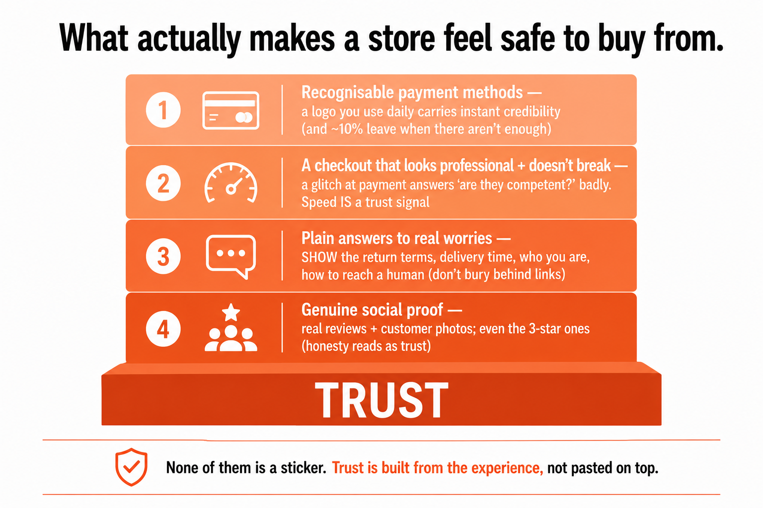
If badges are not the answer, what is? Trust at the point of payment comes from a handful of concrete things, and they are mostly about the experience feeling normal and recognisable rather than about decoration:
- Recognisable payment methods. This one is both a trust signal and a practical necessity, and the data backs both: a meaningful share of shoppers abandon when a site does not offer enough payment options, and beyond the practical problem, seeing a payment method you use every day carries instant, effortless credibility. The familiarity does the reassuring. A checkout that offers the ways people actually pay feels safe precisely because it feels normal.
- A checkout that looks professional and does not break. Nothing destroys trust at the payment step faster than a glitch, an error message, a layout that looks slightly broken, or a page that stalls. At the exact moment someone is deciding whether you are competent enough to handle their money, a technical stumble answers the question for them, badly. This is where trust and site speed overlap directly: a fast, smooth, flawless checkout is a trust signal, and a slow or janky one is a red flag, whatever badges sit on it. Competence reads as trustworthiness, and the payment step is where your competence is most visible.
- Visible, plain answers to what people actually worry about. The real anxieties are specific: what if it does not fit, what if it never arrives, what if I cannot return it, who even are these people. Answer those, plainly and where they are felt. Show the return terms in actual words ("free returns within 30 days"), not buried behind a link nobody clicks. Show the delivery time. Make it obvious who you are and how to reach a human if something goes wrong, real contact details, a findable way to get help. A store that is transparent about the things people worry about feels trustworthy because it is behaving like one with nothing to hide.
- Genuine social proof. As I argued in the product-page piece, people trust other shoppers more than they trust you, so real reviews and customer photos do trust work your own assurances cannot. And transparency matters here too: a store confident enough to show its three-star reviews alongside its five-star ones reads as more honest, and therefore more trustworthy, than one displaying nothing but suspiciously perfect praise.
Notice what these have in common. None of them is a sticker. They are all about the experience being recognisable, competent, transparent, and confirmed by other real people, the qualities that make a place feel safe in the physical world too. You trust a shop that is clean, well-run, staffed by people who answer your questions, and full of other customers. The online equivalent is the same, built from the experience, not pasted on top of it.
Trust is a system, and it is boring on purpose
Here is the principle that ties it together, and the deepest point about trust signals that most advice misses: trust signals do not create intent, they remove the friction between a buyer who already wants to buy and the completed order. A security seal will never convert someone who has no interest in your product, no badge creates desire. What trust does is clear the last obstacle for someone who already decided, by answering the question "is it safe to go through with this?" so they can. That distinction changes where you focus. The job is not "add more trust elements until conversion goes up." The job is to identify the specific doubt your shopper feels at each moment, the same doubt-inventory thinking from the product page, and answer that exact doubt at that exact point. Reassurance about returns belongs where the return worry lives; the security cue belongs at the payment step where the security worry lives, not on a homepage hero where it answers a question nobody is asking yet. Context is everything: put the answer where the anxiety is.
And the broader truth is that trust is not a single decision or a single element, it is a system, where every part of the experience either adds to or subtracts from one feeling: this is a real, competent, safe place to buy. The page speed, the recognisable payment options, the plain return terms, the findable contact details, the honest reviews, a professional checkout that does not stumble, all of it points at the same outcome. Get them aligned and the result is, in the best way, boring: clear, consistent, predictable, a store where the customer never has to wonder who you are, how long delivery takes, how to get help, or whether their card is safe, because every one of those questions was answered before they had to ask. A strong trust result does not feel impressive or clever. It feels unremarkable, and unremarkable is exactly what "safe" feels like.
So if you take one thing from this, let it be the inversion of the usual advice. You do not earn trust by looking trustworthy, by decorating the site with the symbols of safety. You earn it by being trustworthy: by removing every reason to feel uneasy, behaving transparently about the things people worry about, and making the whole experience feel as normal and competent as a well-run shop. The padlock icon is the least of it. The real trust signal is a store that behaves, at every step, like one that has nothing to hide, and that is something you build into the experience, not something you stick on at the end.
A few common questions
Do trust badges actually increase conversions? Less than people think, and stacking them can backfire. Trust genuinely matters, around a fifth of shoppers abandon because they don't trust a site with their card details, but a wall of security seals often reads as protesting too much ("why is this site working so hard to convince me?"), adds visual noise, and can't fix a checkout that feels shaky underneath them. Badges work best as light support for an experience that already feels safe, placed at the moment of financial commitment (checkout), not scattered across the homepage. What builds payment trust is a checkout that feels normal, recognisable, and easy, not the number of logos on it.
What actually makes an online store feel trustworthy? The experience feeling recognisable, competent, and transparent, not decoration. Recognisable payment methods (a payment option people use daily carries instant credibility, and too few options is itself a top abandonment reason). A checkout that looks professional and doesn't break, a glitch or stall at the payment step reads as incompetence exactly where competence matters most, which is why speed is itself a trust signal. Plain, visible answers to real worries: return terms shown in words not buried behind a link, delivery times, clear contact details. And genuine social proof, real reviews and customer photos, including the less-than-perfect ones, which read as honest.
Where should I put trust and security signals? Where the anxiety is, which is context-dependent. A security cue works at the moment of financial commitment, the payment step, where the shopper is asking "is my card safe here?", not on a homepage hero where nobody is asking that yet. Return and delivery reassurance belongs where those worries live, on the product page and in the cart. The principle is to identify the specific doubt a shopper feels at each point and answer that exact doubt right there, rather than scattering generic reassurance everywhere and hoping.
How do trust signals affect conversion if they don't create demand? They remove the last obstacle for someone who already wants to buy. A trust signal won't convert a person with no interest in your product, no badge creates desire. What it does is clear the question "is it safe to go through with this?" for a buyer who already decided, so they can complete the order instead of getting cold feet at the threshold. That's why the goal isn't adding more trust elements, it's identifying the specific doubt blocking a willing buyer at a specific moment and answering it there.
You should also read:
Discounts Are a Loan Against Your Margin
A discount feels free to give, and that is exactly why it is dangerous. It is a loan against your margin, and like any loan it gets repaid: in the margin you hand over, in the reference price you quietly reset, and in the customers…
Continue reading...
Reviews Are the One Voice on Your Page a Shopper Trusts More Than Yours
There is exactly one voice on your product page that a shopper trusts more than your own, and it is not yours. It is other customers. Everything you write about your product, however honest, carries an unavoidable discount in the reader's mind, because they know…
Continue reading...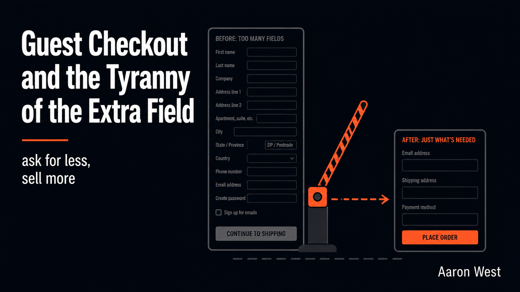
Guest Checkout and the Tyranny of the Extra Field
Two of the most damaging things you can do at checkout are entirely self-inflicted, and they come from the same mistake: putting your convenience ahead of the customer's. The first is forcing people to create an account before they can buy. The second is making…
Continue reading...