The Product Page Is Where You Win or Lose the Sale

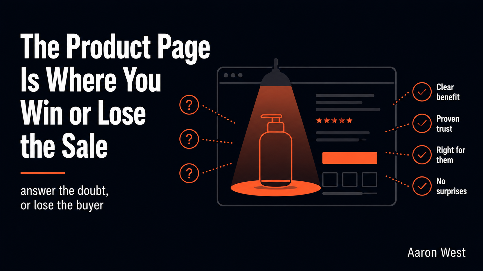
Table of Contents
The product page is where the buying decision actually gets made, which makes it the most important page on your store, and the one most stores treat as an afterthought. Everything before it, the ads, the homepage, the category listings, only does one job: deliver an interested person to a specific product. The category page filters interest; the product page has to close it. By the time someone is looking at a single product, they are no longer asking "is this store worth my time," they are asking "should I buy this," and the page either answers that question well enough to earn the click on "add to cart," or it does not and they leave. Get the product page right and you improve every sale that follows it. Get it wrong and all the traffic in the world just bounces off it.
This is a core piece under my cornerstone on where online stores lose the sale, drilling into the product stage, the leak that happens after someone is interested in a specific item but before they commit. It is a different problem from checkout abandonment: checkout loses people who already decided to buy, the product page loses people who were deciding. The currency here is not friction, it is confidence. And the thing I learned watching real people use real product pages is that they almost never leave because they disliked the product. They leave because a question went unanswered and the doubt won. Plain language, from the usability-research side of my work.
What actually loses people: unresolved doubt
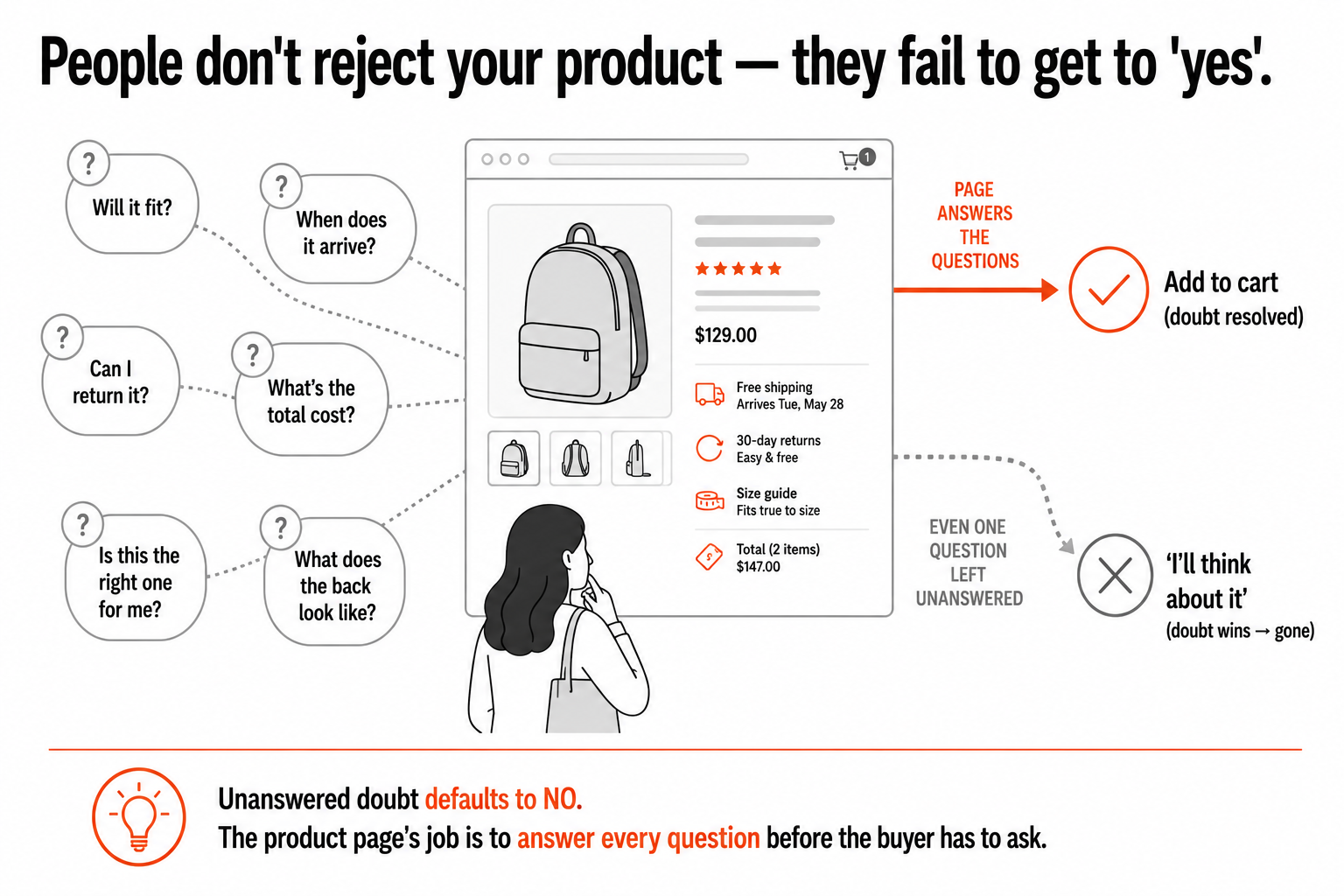
Here is the reframe that changes how you build a product page: people do not abandon a product page because they decided no, they abandon it because they could not get to yes. There is a difference. A genuine "this isn't for me" is fine, that person was never going to buy. But far more often, someone who was interested enough to click leaves because a specific question, will this fit, does it come in time, can I return it, what does the back look like, is this the right one for my situation, went unanswered, and unanswered doubt defaults to no. They did not reject your product. They failed to get the reassurance they needed to choose it, so they left to "think about it," which usually means they are gone.
This is why the single most useful way to think about a product page is as an answering machine for doubt. Every hesitation a real buyer might have is a small barrier between them and the purchase, and your page's job is to remove each one before they have to go looking, because if they have to leave the page to find an answer, a size chart, a shipping estimate, a return policy, a real photo of the thing from the angle they care about, a meaningful share of them will not come back. The frustrating truth, well documented across the industry, is that most product pages do this badly: a large share of sites fail to show the total cost including shipping on the product page, or to clearly link a return policy, and both of those gaps are among the top reasons people abandon. These are not subtle design failures. They are unanswered questions, sitting in plain sight, quietly costing sales.
So the product page is not really a "design" problem in the decorative sense. It is an information completeness problem dressed up as a design problem. The best product pages are not the prettiest, they are the ones where a hesitating buyer can find the answer to every reasonable question without ever leaving the page or feeling they are being kept in the dark. Beauty helps; completeness sells.
The doubt inventory: the method that fixes it
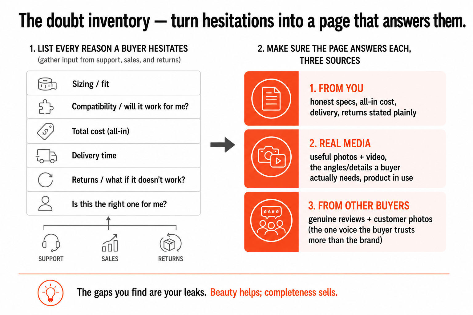
The practical method follows directly, and it is something anyone can do without special tools: make a list of every reason a real person hesitates over your product, then make sure the page answers each one. I call it a doubt inventory, and it is the single most useful exercise for a product page. Sit down, ideally with input from whoever talks to your customers (support, sales, returns), and write out every question and worry that comes up before a purchase. For clothing that is sizing, fit, fabric, how it looks on a real body. For electronics it is compatibility, what is in the box, specs that matter. For anything shipped it is cost, delivery time, and what happens if it is wrong. Then go to your product page and check, ruthlessly, whether each one is answered clearly and without the buyer having to hunt. The gaps you find are your leaks.
Some of those answers come from you, and the principle is to be generous and honest with information: clear specs, the details that actually matter for the decision, the total cost without surprises, the delivery estimate, the return terms stated plainly rather than buried. Real, useful photos do enormous work here, not just the polished hero shot but the angles and details a buyer actually wants, the thing in use, in context, at the scale they need to judge it. A short video or a view from multiple angles often answers in seconds what a paragraph of description cannot. The goal is for someone to feel they have seen and understood the product as well as they could in a shop, because the doubt you are fighting is the fundamental disadvantage of buying something you cannot physically hold.
And some of the most powerful answers do not come from you at all, they come from other buyers. Reviews, and especially customer photos, resolve doubt in a way your own marketing structurally cannot, because a hesitating shopper trusts another shopper's experience more than they trust the brand trying to sell to them. Someone unsure whether a jacket runs small will believe a reviewer who says "I'm usually a medium and sized up" far more than any size guide. That is why genuine reviews and real customer photos are not a nice-to-have decoration, they are confidence infrastructure, doing the specific job of answering the doubts your own copy is least trusted to answer. A product page rich with honest peer experience is answering questions on your behalf, around the clock, in the one voice the buyer believes.
Honesty here pays twice
One last principle, and it is the one people resist most because it feels like it should hurt sales: be honest on the product page, including about limitations, because dishonesty does not prevent the lost sale, it just moves the loss somewhere more expensive. A vague or flattering description that hides a product's real dimensions, a genuine drawback, or an honest delivery time does not make people buy more. It makes the wrong people buy, and a wrong purchase comes back. Returns are not free, they cost a chunk of the item's value to process, and worse, they cost you the trust of a customer who feels misled, who will not return and may tell others. The sale you "won" with a vague page was not a win, it was a deferred, costlier loss.
Honest, complete information does the opposite. It loses you the few sales that were never a good fit anyway, the person who would have returned it, and it wins and keeps the ones that are right, because the buyer got exactly what the page promised. This is the same lesson that runs through all my conversion writing, and it is genuinely the heart of it: good UX is not manipulation, it is the removal of obstacles between a person and a decision that is right for them. A product page built that way, complete, honest, answering every reasonable doubt before it is asked, does not trick anyone into buying. It helps the right people buy with confidence and gives the wrong ones permission to walk, and that is exactly the trade you want, because it builds a base of customers who got what they expected and come back. Win the decision honestly on the product page, and you win the harder, more valuable thing underneath the sale: a customer who trusts you. That is worth far more than any single conversion, and it is the quiet compounding advantage of doing this well.
A few common questions
Why is the product page so important for conversion? Because it's where the buying decision actually gets made. Everything before it, ads, homepage, category pages, only delivers an interested person to a specific product; the category page filters interest, but the product page has to close it. By the time someone is looking at one product, they're asking "should I buy this," and the page either answers well enough to earn the add-to-cart or it doesn't and they leave. That's why the product page carries more conversion weight than the homepage, and why fixing it improves every sale that follows.
Why do people leave a product page without buying? Usually not because they decided no, but because they couldn't get to yes. Far more often than genuine rejection, someone interested enough to click leaves because a specific question, will it fit, when does it arrive, can I return it, what does it actually look like, went unanswered, and unanswered doubt defaults to no. They didn't reject the product; they failed to get the reassurance they needed and left to "think about it." A large share of sites don't even show total cost or link a return policy on the product page, both top abandonment reasons.
How do I make a product page convert better? Build a "doubt inventory." List every reason a real person hesitates over your product (with input from support, sales, and returns), then check, ruthlessly, that the page answers each one clearly without the buyer having to hunt. Answers come from three places: honest information from you (clear specs, all-in cost, delivery, returns stated plainly), real useful media (photos and video showing the angles and details that matter, the product in use), and other buyers (genuine reviews and customer photos, the voice a shopper trusts more than the brand). The gaps you find are your leaks.
Should I be honest about a product's limitations on the page? Yes, and it pays twice. A vague or flattering page that hides real dimensions, drawbacks, or delivery times doesn't prevent lost sales, it just makes the wrong people buy, and a wrong purchase comes back as a return, which costs a chunk of the item's value and the trust of a customer who feels misled. Honest, complete information loses the few sales that were never a good fit and wins and keeps the ones that are right. Good product-page UX isn't manipulation, it's removing obstacles between a person and a decision that's right for them, which builds customers who come back.
You should also read:
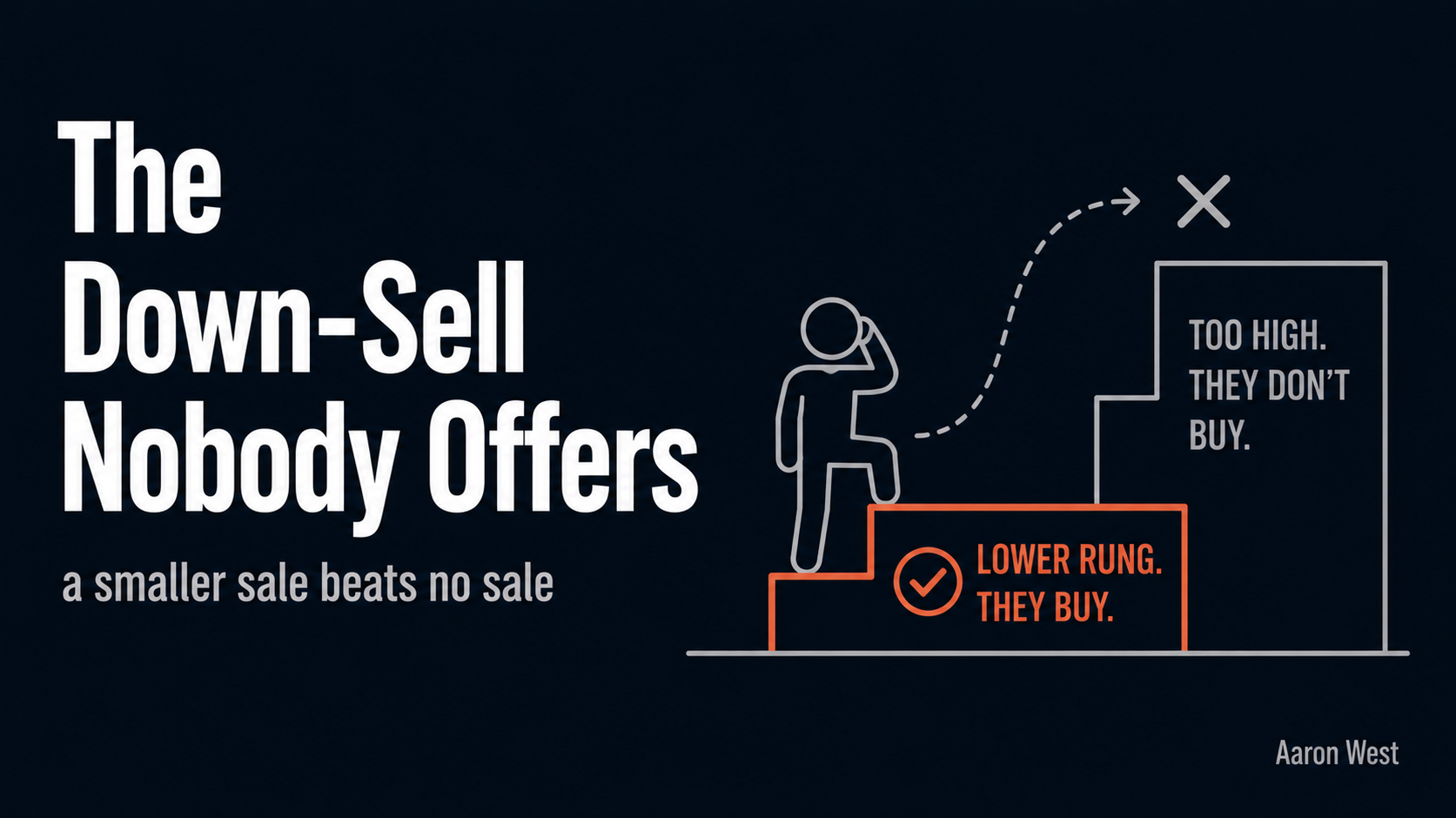
The Down-Sell Nobody Offers (and Why It Saves the Sale)
Almost every online store has an upsell. Almost none have a down-sell. We pour energy into getting customers to spend more, the upgrade, the add-on, the bundle, and we completely ignore the move that saves the sale when a customer is about to spend nothing.
Continue reading...
The Thank-You Page: Where Conversion Ends and Retention Begins
The moment right after someone buys from you is the single highest-trust, highest-goodwill moment you will ever get with that person. They have just said yes. They have handed over their card, their email, their address. Their guard is down and their momentum is forward.
Continue reading...
Reviews Are the One Voice on Your Page a Shopper Trusts More Than Yours
There is exactly one voice on your product page that a shopper trusts more than your own, and it is not yours. It is other customers. Everything you write about your product, however honest, carries an unavoidable discount in the reader's mind, because they know…
Continue reading...