Where Online Stores Lose the Sale

Table of Contents
Most online stores spend almost all their energy trying to get more people to show up, and almost none on the fact that the overwhelming majority of the people who already showed up leave without buying. This is backwards. You have, sitting in your analytics right now, a crowd of people who found you, were interested enough to visit, and then left empty-handed. Winning even a small fraction of them back is usually cheaper and faster than buying a fresh crowd through ads, and yet it is the work that gets neglected, because finding the leaks is harder and less exciting than buying more traffic. This piece is about where that leaking happens, why, and how to think about fixing it.
I come at this from a specific angle. Before and alongside my e-commerce work, I spent a long time in usability research, sitting with real people as they tried to use real interfaces, across hundreds of them. When you watch enough actual humans struggle with screens that their designers were certain were obvious, you stop believing your own assumptions about what is "clearly" easy to use, and you start seeing the small frictions everyone else steps over. That is the lens here: conversion is not a growth-hacking trick, it is the practical study of where and why real people give up, and the discipline of removing the reasons one at a time.
This is the cornerstone of my conversion and user-experience writing. It connects to the performance-marketing work directly, because, as I argue there, advertising only amplifies what you already have, so a leaking store just pays to pour more people into a bucket with holes. I will walk the funnel stage by stage, where stores lose people and the kind of friction that does it, then explain the single most important method for finding your own leaks rather than guessing at them. Plain language, my own point of view, no jargon for its own sake.
The funnel as a set of leak points
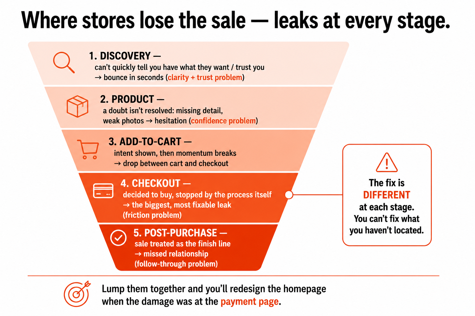
It helps to picture the path to a purchase as a series of stages, because people drop out at every one, and the reason they drop out is different at each. A useful way to see it: discovery, product, add-to-cart, checkout, and the post-purchase moment. Money leaks at all five, and treating them as one undifferentiated "conversion problem" is exactly why so many fixes miss.
At the discovery stage, people arrive and cannot quickly tell whether you have what they want or whether you are trustworthy. If they cannot find the right product fast, through clear navigation and a search that actually works, or if the site feels slow or sketchy, they leave within seconds. A huge share of visitors bounce here, having formed a snap judgment before they ever saw a product. At the product stage, people are looking at something specific but hesitate: the photos do not answer their questions, a key detail (size, fit, compatibility, delivery time) is missing, or there is nothing to build confidence that this is the right choice. Uncertainty, not disinterest, is what loses people here, they would buy if their doubt were resolved, and it is not.
The add-to-cart stage is the first strong signal of intent, and then a surprising number of people still vanish between adding an item and starting checkout, often because something interrupts the momentum or a doubt creeps in. The checkout stage is where the most painful losses happen, because these are people who decided to buy and then were stopped by the process itself, more on this in a moment, because it is the single biggest and most fixable leak. And the post-purchase moment, the thank-you page and what follows, is where stores routinely leave money on the table by treating the completed sale as the finish line rather than the start of a relationship, missing the easy chance to encourage a review, a return visit, or a second purchase.
The point of breaking it into stages is not tidiness. It is that the fix is different at each stage, and you cannot fix what you have not located. Bouncing at discovery is a clarity-and-trust problem; hesitation at the product stage is a confidence problem; checkout loss is a friction problem; post-purchase loss is a follow-through problem. Lump them together and you will redesign your homepage when the real damage was happening three steps later at the payment page. Separate them, and each leak points at its own kind of fix.
Checkout: the most expensive leak, and the most fixable
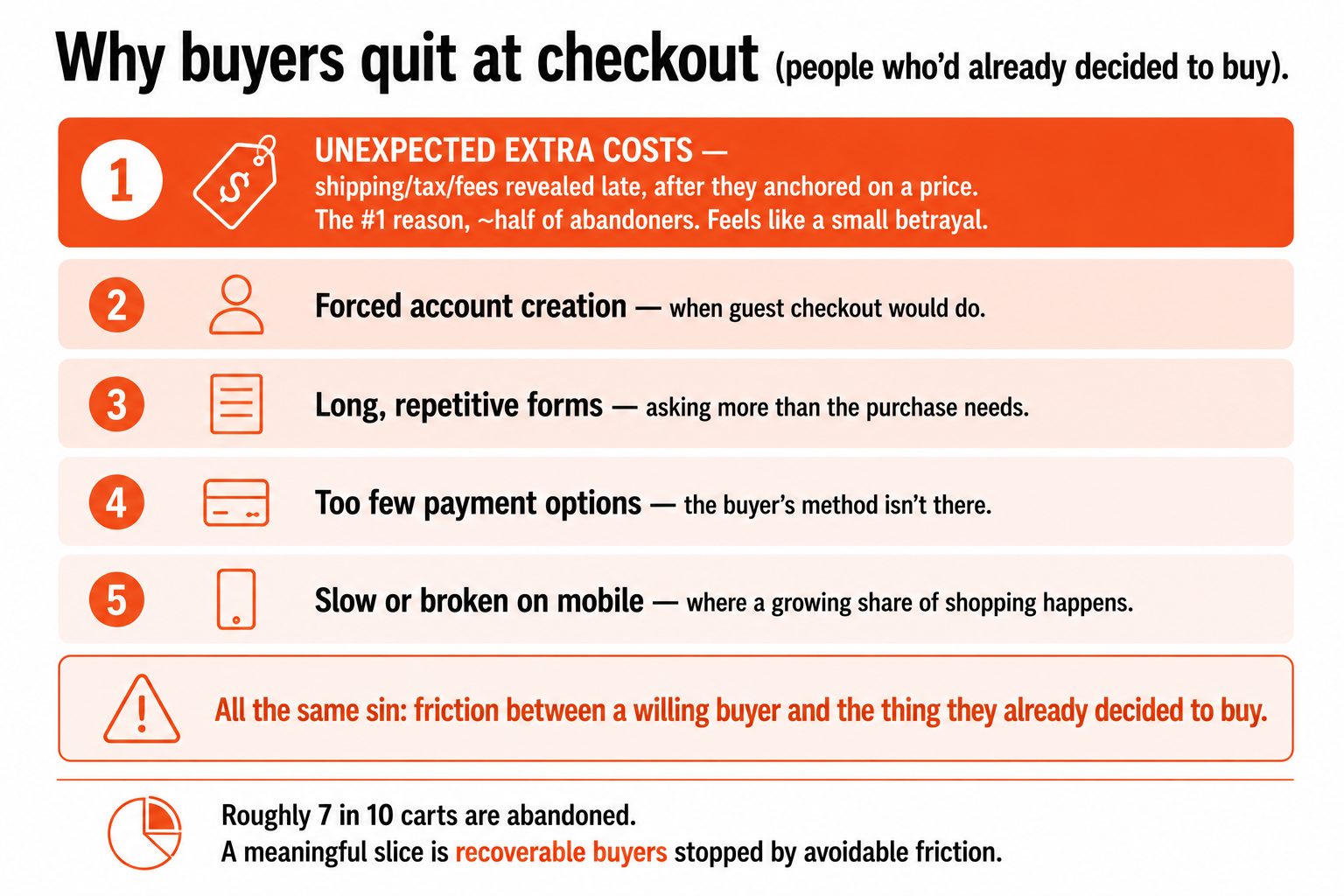
If you fix one thing, fix checkout, because the people you lose there are the most valuable people you have: they decided to buy. They wanted your product, they got all the way to the payment step, and then something in the process itself made them quit. Across the industry, roughly seven in ten carts are abandoned. Not all of that is recoverable, plenty is idle browsing and price-comparison that was never going to convert, but a meaningful slice is genuine buyers stopped by avoidable friction, and that is pure recoverable revenue sitting in your funnel.
The reasons are well studied and remarkably consistent, and the top one is worth burning into memory: unexpected extra costs. When shipping fees, taxes, or surcharges appear late in the checkout, after someone has mentally committed to a price, it is the single most common reason they abandon, cited by roughly half of all people who bail. The psychology is simple and brutal: you anchored them on one number, then quietly raised it, and it feels like a small betrayal. Showing the true, all-in cost early, or removing the surprise entirely, addresses the biggest checkout leak there is.
After that come a familiar cast of friction points, each one a place where you ask too much of someone who was ready to give you money. Forcing people to create an account before they can buy, when a guest checkout would do, sends a chunk of them straight out the door. Long, repetitive forms that demand more information than the purchase needs wear people down. Too few payment options means the person who only uses one method simply cannot complete the purchase. And a checkout that is slow or breaks on a phone, where a large and growing share of shopping happens, loses people who would happily have bought on a working flow. None of these are mysterious. They are all the same underlying sin: friction standing between a willing buyer and the thing they already decided to buy.
I will give you the example that I have made before, publicly, because it captures the whole category in one tiny detail. A prominent retailer's checkout, at the moment of payment, put a wide, inviting "enter your voucher code" field front and centre. For every customer with a code, fine, but for everyone without one, that empty box is a small flashing prompt that says "other people are getting a better price than you," and a portion of them will pause, open a new tab, go hunting for a discount code, and never come back. A single design choice, meant to be helpful, quietly leaking sales at the exact moment of highest intent. That is what checkout friction looks like in the wild: rarely a catastrophe, usually a small thoughtless detail multiplied across thousands of buyers. The job is to find those details and remove them, and the detail is almost never where you would have guessed.
The method: find your leaks, don't guess at them
Here is the part that matters more than any individual fix, and the discipline that separates people who actually improve conversion from people who just redecorate: stop guessing where you lose people and go find out. The single most common waste in this work is pouring effort into a redesign of the wrong thing, polishing a homepage that was converting fine while the real haemorrhage was a broken payment step nobody looked at. Cart abandonment and checkout abandonment are symptoms; the work is tracing them back to the specific friction point causing them.
There are two layers to seeing your own funnel, and you need both. The first is the aggregate view: your analytics can show you, stage by stage, what proportion of people move forward and what proportion drop out. This tells you where the biggest leak is, which stage, even which step within checkout (cart to shipping, shipping to payment, payment to confirmation), is losing the most people. That alone is enormously clarifying, because it tells you where to point your attention instead of guessing. But aggregate numbers only ever tell you where, never why. A 60% drop at the payment step is a flashing arrow, not an explanation.
The second layer is watching actual behaviour, and this is where my usability-research instinct kicks in hardest: the why almost always comes from observing real people, not from staring at charts. Watching real sessions, or better still real users, reveals the things aggregate data structurally cannot, the moment of hesitation on a confusing form field, the repeated frustrated clicking on something that does not respond, the person who scrolls up and down looking for a piece of information that is not there and then leaves. Those behavioural signals are the actual reasons behind the numbers, and they are almost always more mundane and more specific than you imagined. The lesson I took from hundreds of usability sessions is that the real problem is never the grand strategic thing you were debating in a meeting; it is a tiny, concrete, fixable detail that you stopped being able to see because you were too close to it. Aggregate data finds the room the problem is in. Watching people tells you what the problem actually is.
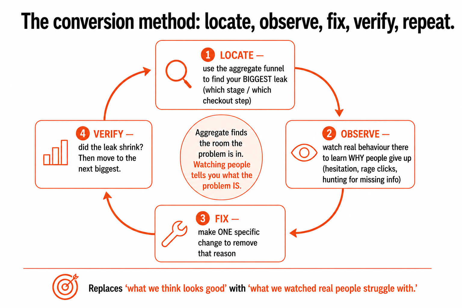
So the method is a loop, and it is not complicated: use the aggregate funnel to locate your biggest leak, watch real behaviour at that point to understand why people give up, make one specific change to remove that reason, and check whether the leak shrank. Then do it again at the next biggest leak. That is the whole discipline. It is unglamorous and it works, and it beats any amount of redesigning-by-opinion, because it replaces "what we think looks good" with "what we watched real people actually struggle with." Conversion work, done honestly, is just this: locate, observe, fix, verify, repeat. The stores that compound small wins this way quietly out-earn the ones chasing ever more traffic into a leaking bucket, and they spend less to do it.
That is the heart of it. The traffic you already have is your cheapest growth, the leaks are findable if you look properly instead of guessing, and the biggest, most fixable one is almost always sitting in your checkout. Start there, find the friction, take it out, and you will make more from the same number of visitors, which is the most durable advantage in all of e-commerce.
A few common questions
Why focus on conversion instead of getting more traffic? Because the traffic you already have is your cheapest growth. The overwhelming majority of people who visit a store leave without buying, and winning back even a small fraction of them is usually cheaper and faster than buying a fresh crowd through ads. Advertising only amplifies what you already have, so if your store leaks customers, more traffic just means paying to pour more people into a bucket with holes. Fixing the leaks improves the return on every visitor and every ad euro at once, which is why it's the most durable advantage in e-commerce, and the most neglected.
Where do online stores lose the most sales? At every funnel stage, but for different reasons. At discovery, people bounce in seconds if they can't quickly tell you have what they want or can't trust the site. At the product stage, they hesitate when a doubt (a missing detail, weak photos) goes unresolved. Between add-to-cart and checkout, momentum breaks. At checkout, the most painful losses happen, people who decided to buy, stopped by the process itself. And after the sale, stores leak by treating the thank-you page as the finish line. The single biggest and most fixable leak is almost always checkout.
What's the number one reason people abandon checkout? Unexpected extra costs. When shipping, taxes, or fees appear late, after someone has mentally committed to a price, it's the most common reason they abandon, cited by roughly half of all abandoners. You anchored them on one number then quietly raised it, and it feels like a small betrayal. Showing the true all-in cost early, or removing the surprise, addresses the biggest checkout leak there is. After that come forced account creation, long forms, too few payment options, and checkouts that are slow or break on mobile, all variations of asking too much of someone who was ready to pay.
How do I find where my own store is losing people? Two layers, and you need both. Use your analytics for the aggregate view, stage by stage, even step by step within checkout, to find where the biggest drop-off is. That tells you where, but never why. Then watch actual behaviour at that point, real sessions or real users, to see the reason: hesitation on a form field, frustrated clicking, someone hunting for missing information and leaving. The why is almost always a mundane, specific, fixable detail you'd stopped being able to see. Then make one change, check whether the leak shrank, and repeat at the next biggest leak. Locate, observe, fix, verify, repeat.
You should also read:
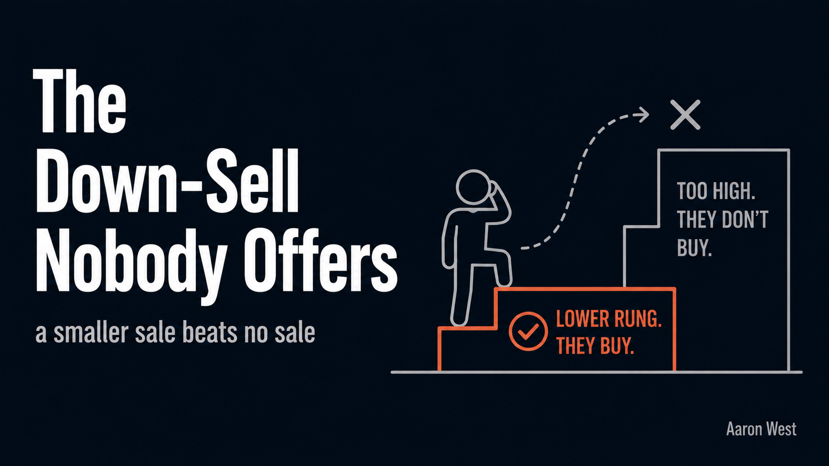
The Down-Sell Nobody Offers (and Why It Saves the Sale)
Almost every online store has an upsell. Almost none have a down-sell. We pour energy into getting customers to spend more, the upgrade, the add-on, the bundle, and we completely ignore the move that saves the sale when a customer is about to spend nothing.
Continue reading...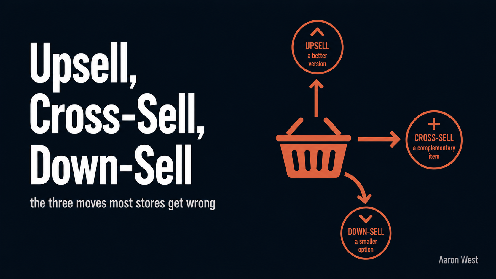
Upsell, Cross-Sell, Down-Sell: The Three Moves Most Stores Get Wrong
Raising the average order value, getting each customer who already chose to buy to spend a little more, is usually the fastest and cheapest way to grow an e-commerce business. You are not paying to acquire anyone or convince anyone, you are making more of…
Continue reading...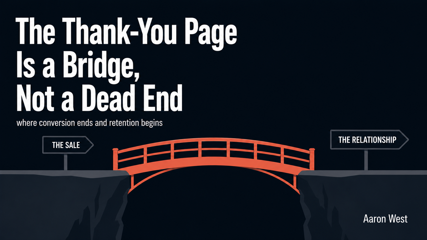
The Thank-You Page: Where Conversion Ends and Retention Begins
The moment right after someone buys from you is the single highest-trust, highest-goodwill moment you will ever get with that person. They have just said yes. They have handed over their card, their email, their address. Their guard is down and their momentum is forward.
Continue reading...