Faceted Navigation and Filtering: Helping People Narrow Without Getting Lost

Table of Contents
Faceted navigation is the set of filters that lets a customer cut a large category down to the products that actually fit them, by size, price, colour, brand, use, whatever matters to their choice. Done well, it turns an overwhelming catalogue into a manageable shortlist in a few clicks. Done badly, with too many filters, the wrong filters, or filters built around your database instead of the customer's decision, it adds confusion to the exact page where people came to narrow down. The bigger your catalogue, the more this one feature carries the entire experience.
This is a core of the Merchandising pillar, and it sits right alongside category pages: the category page shows the group, and filtering is how the customer turns that group into a shortlist they can choose from. Here's the principle that fixes most filter problems, and the failure modes that create them.
Why filters carry big catalogues
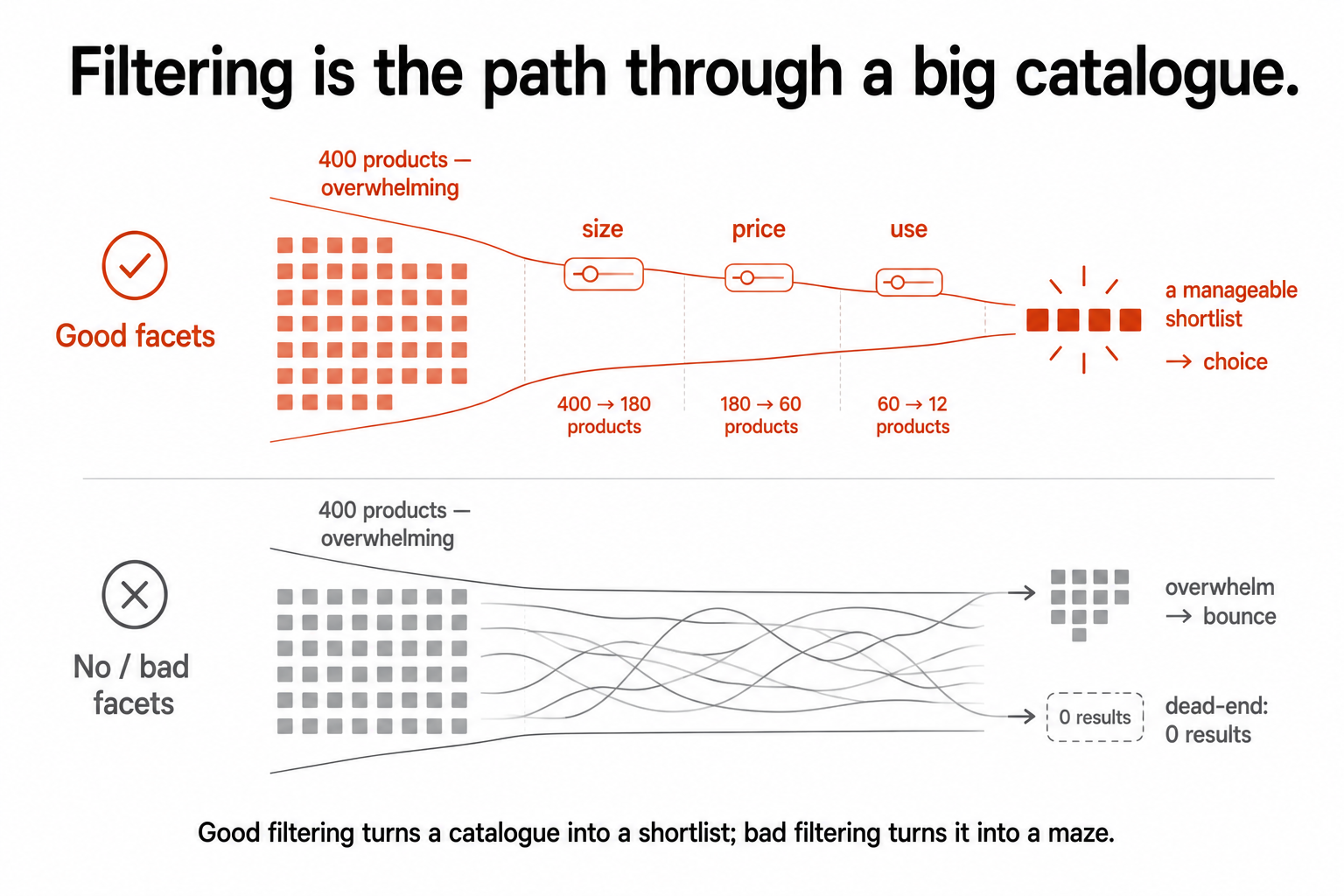
In a small category, browsing works fine; you can scan twenty products and decide. In a category with three or four hundred products, browsing is hopeless. No customer scrolls through hundreds of items, so without a way to narrow, the only realistic outcomes are that they pick from the first screen, which makes your default sort order do all the work, or they leave. Filtering is the difference. It's the online equivalent of being able to walk straight to the right shelf instead of wandering the whole shop.
So the size of your catalogue tells you how much filtering matters. A boutique store with thirty products barely needs facets. A store with thousands lives or dies by them, because filtering is the only realistic path most customers have to the specific products that fit them. And this is squarely the findability job from the cornerstone: helping the customer who knows roughly what they want get to it fast. Bad filtering is friction applied to your most ready-to-buy browsers.
The principle: filter by how customers decide, not how your data is structured
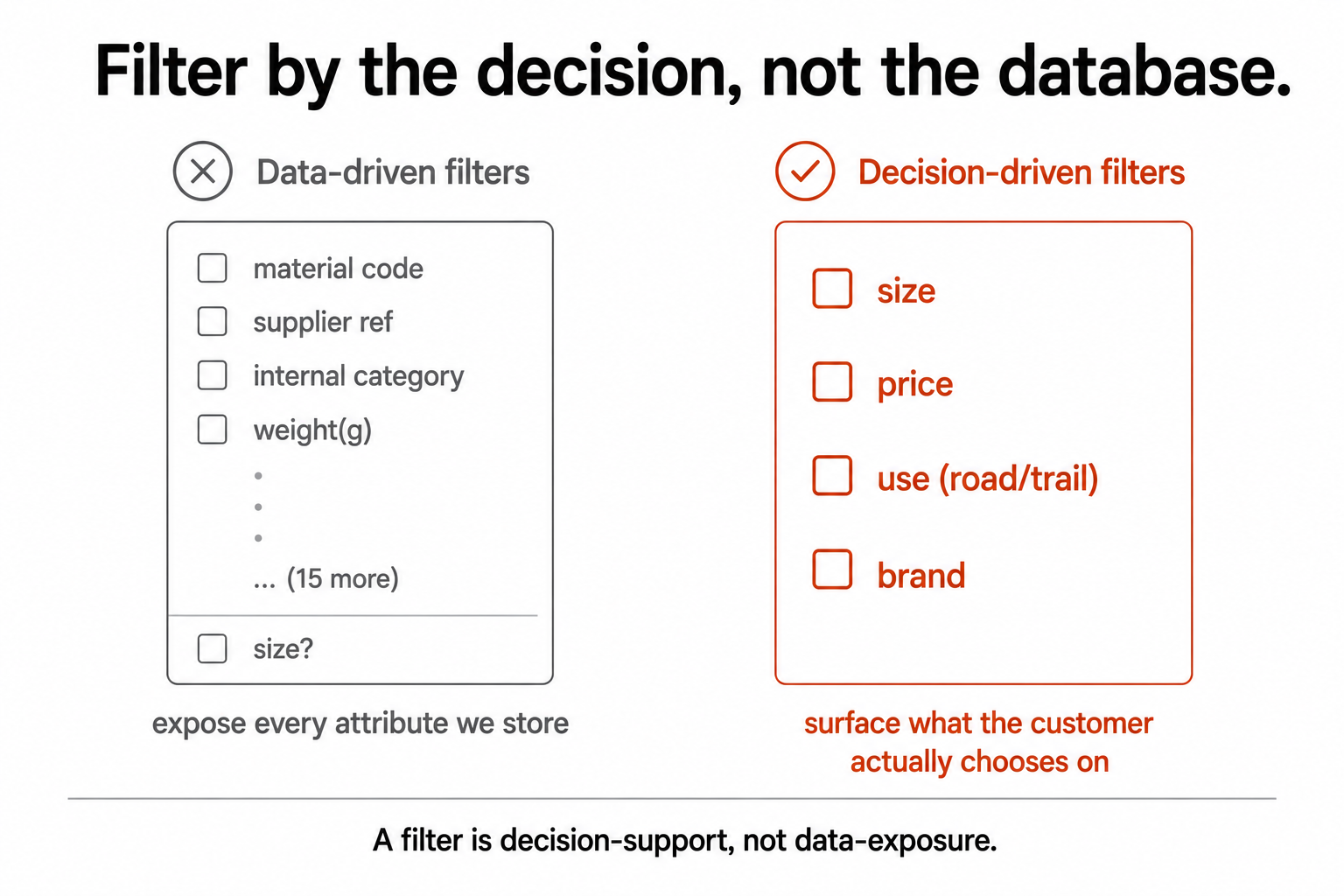
Here's the single idea that fixes most filtering problems. Customers narrow down using the attributes that matter to their decision, the handful of things they actually care about when choosing this kind of product. Your catalogue, meanwhile, stores dozens of attributes, many of them internal, technical, or irrelevant to the buyer. The mistake almost every store makes is exposing filters based on what's in the database rather than on how the customer decides.
Think about buying running shoes. The decision attributes are size, price, maybe gender, maybe a use like trail versus road, maybe brand. That's most of it. But a catalogue might also store material codes, supplier references, internal categories, weight in grams, and a dozen other fields, and a store that "just exposes the attributes we have" ends up with a wall of filters where the one that matters most, size, is buried among fifteen that don't, or worse, missing entirely. A clothing store with no size filter has failed at the single most important facet while offering ten nobody wanted.
The reframe is simple but it changes everything: a filter is a decision-support feature, not a data-exposure feature. Ask "how does a customer choose this kind of product," surface those attributes prominently, and let the rest collapse out of the way or disappear entirely. Build the filters around the customer's decision, not your database schema.
The failure modes
Filtering goes wrong in a handful of recognisable ways, and they pull in opposite directions, which is why "add more filters" is rarely the fix:
- Too few, or none. A four-hundred-product category with only "sort by price" and no real facets. The customer has no way to narrow and drowns. This is the most common failure on stores that grew their catalogue without revisiting navigation.
- Too many. Thirty facets, half irrelevant, presented all at once. More choice here isn't more helpful; it's paralysis. The customer can't tell which filters matter, so they use none.
- The wrong ones. Filtering by attributes nobody chooses on while missing the decisive one. The clothing-store-with-no-size-filter is the classic, but every category has its equivalent: the one attribute customers genuinely decide on, left out.
- Dead-ending combinations. Letting a customer stack filters until the result is zero, then dropping them on a blank page with no obvious way back. That's the zero-results problem created by your own filters, and it's entirely preventable.
- Invisible state. The customer can't see what they've filtered by, or can't easily undo a choice. They feel trapped rather than in control, which is the opposite of what filtering is for.
What good faceting actually does
Getting it right is mostly about respecting how people actually use filters:
- Surface the decision attributes first, and collapse or hide the long tail. The two or three filters that matter should be obvious and immediate; the rest can be there for the minority who want them, out of the way for everyone else.
- Show result counts next to filter options, so a customer can see that "size 12" has four products before they pick it and hit a near-empty page. Counts prevent self-inflicted dead ends.
- Make applied filters visible and removable. A clear row of "you've filtered by: size 12, under €100, blue" that the customer can edit or clear keeps them in control and encourages experimentation, because undoing is easy.
- Handle the empty combination gracefully. When filters combine to zero results, don't dead-end. Relax the least important filter automatically, or suggest which one to remove, or show the nearest matches. Never leave them staring at nothing.
- Respect mobile. Most of your traffic is on a small screen, where filtering is harder to present and more essential, because scrolling a huge category on a phone is even worse than on a desktop. The filter experience has to work thumb-first, not as a desktop panel crammed onto a phone.
There's a discoverability footnote worth a flag rather than a deep dive: filtered pages create URLs, and those can either help you (a genuinely useful, indexable facet page that ranks for "blue running shoes under €100") or hurt you (an infinite crawl trap of pointless filter combinations). It's worth handling deliberately, and it's covered properly in the discoverability material rather than here.
What this comes down to
A filter is not there to show off how many attributes you store. It's there to help a customer who's a little lost in a big catalogue find the few products that are actually right for them. Build the filters around how customers decide, not around your database schema; surface the attributes that matter and hide the ones that don't; show counts, keep state visible, and never let people filter themselves into a blank wall.
Get it right and a catalogue of thousands feels like a shop the customer can navigate confidently. Get it wrong and the same catalogue feels like a warehouse with a broken map, which sends your most ready-to-buy browsers somewhere easier to shop. The catalogue is the same either way. The filtering is what decides whether it's navigable.
A few common questions
What is faceted navigation? It's the system of filters that lets a customer narrow a large category down to the products that fit them, by attributes like size, price, colour, brand, or use. It's the online equivalent of walking straight to the right shelf instead of wandering the whole shop, and the larger your catalogue, the more the entire browsing experience depends on it working well.
What's the most common filtering mistake? Building filters around your database instead of the customer's decision. Stores expose the attributes they happen to store, which buries or omits the few that customers actually choose on (like size in a clothing store) under many that nobody uses. A filter is a decision-support feature: surface the two or three attributes people genuinely decide on, and collapse or drop the rest.
Is more filters better? No. Too many filters cause paralysis just as too few cause drowning. The goal isn't maximum choice; it's the right choice, the handful of decision attributes made obvious, with the long tail tucked away for the minority who want it. Thirty facets presented at once usually means customers use none of them.
How do I stop customers hitting "no results" from filtering? Show result counts next to filter options so people can see what's available before they pick, keep applied filters visible and easy to remove, and handle empty combinations gracefully by relaxing the least important filter or suggesting nearest matches rather than dropping the customer on a blank page. A zero-results page caused by your own filters is entirely preventable
You should also read:

Email Segmentation: Sending Less to the Right People, Not More
Segmentation isn't about slicing your list into clever demographic buckets. It's about sending less email to more relevant people, the discipline of not sending a message to everyone just because you can. Done right, it's the opposite of the megaphone, and sending less to the…
Continue reading...
Comparison Sites, CSS, and Sub-Networks: The Partners People Forget
Comparison sites and Comparison Shopping Services (CSS) are affiliate-adjacent partners that list your products alongside competitors so shoppers can compare, then send the click your way for a fee or a commission. They are the partner type most programmes barely think about, which is a…
Continue reading...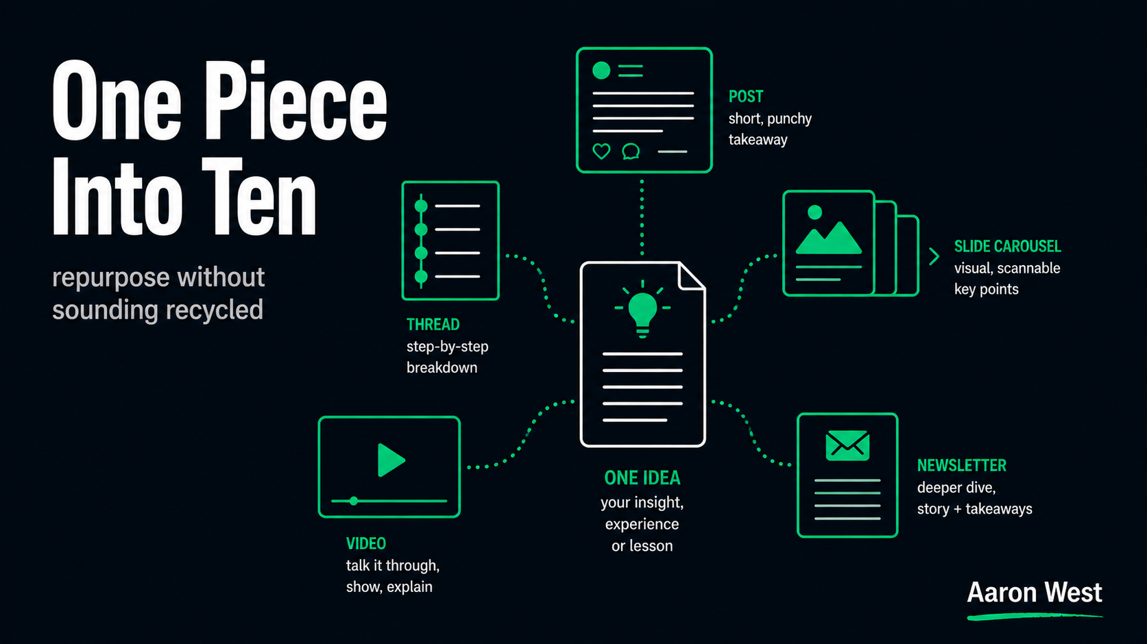
How I Use AI to Turn One Piece of Content Into Ten (Without It Sounding Recycled)
The promise of AI content repurposing is seductive: write one thing, turn it into ten, flood every channel. The reality is that most people do it badly, and badly here has a specific, recognisable shape, they take one post and paste a near-identical version onto…
Continue reading...