Category and Collection Pages: The Most Under-Optimised Pages in E-Commerce

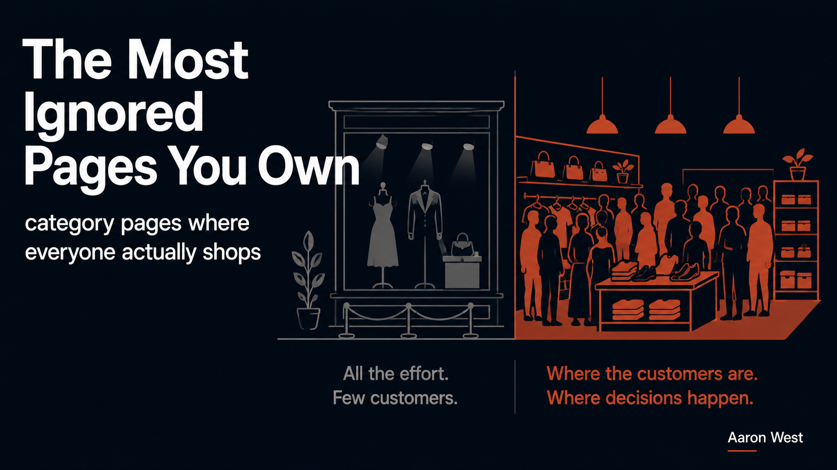
Table of Contents
Category and collection pages, the pages that list products in a group like "men's running shoes" or "gifts under fifty," are where most of your browsing customers actually shop, and they're the most under-optimised pages in e-commerce. More real buying decisions happen on a good category page than on the homepage everyone fusses over, yet most stores leave their category pages as an automatic, unsorted grid of whatever the catalogue dumps in, and never touch them again.
This is a core of the Merchandising pillar, the browsing counterpart to the high-intent on-site search piece. Where search serves the customer who knows exactly what they want, the category page serves the much larger group who have a general intent and are narrowing toward a choice. Here's why these pages matter more than the homepage, why they're so neglected, and what a category page that's actually merchandised does differently.
The window and the shop floor
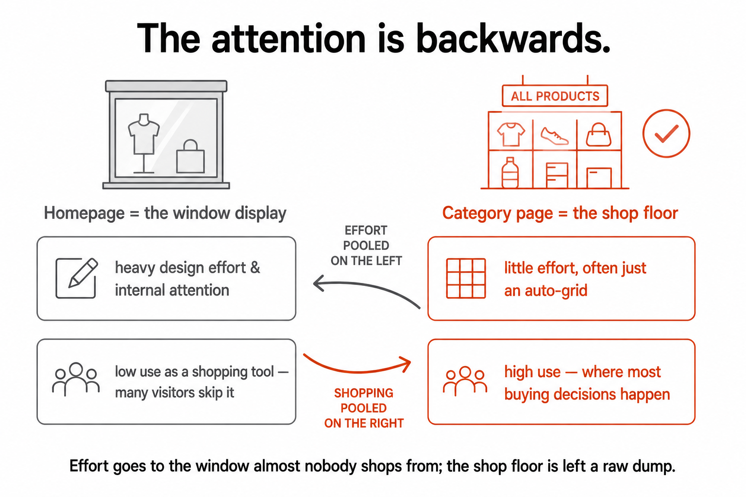
Most stores get their priorities exactly backwards, and the clearest way to see it is the old physical-retail distinction between the window display and the shop floor.
The homepage is the window display. It's where design effort, brand polish, and internal politics concentrate, the page everyone in the company has an opinion about. And it matters, for first impressions and for brand. But here's the thing most teams forget: a large share of visitors never use the homepage as a shopping tool at all. They arrive on a category or product page directly, from a search engine, an ad, a link, and they shop from there. The homepage is the window they may have glanced at on the way in, or skipped entirely.
The category page is the shop floor. It's where someone with a general intent, "I want running shoes," "I need a gift in this budget," narrows down to a specific product they'll actually buy. It's where the browsing-to-buying transition happens for most customers. And it typically gets a fraction of the attention the homepage gets, often none at all beyond whatever the platform generated automatically. So the effort goes into the window almost nobody shops from, and the shop floor where everybody shops is left as a raw inventory dump. The attention is backwards.
The default-grid problem
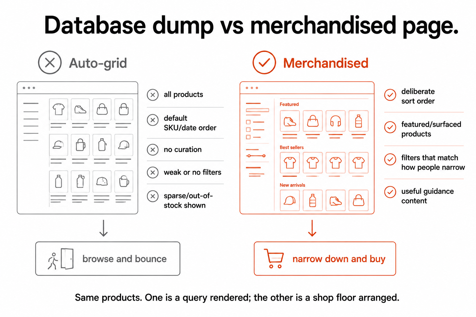
Open a typical category page and here's what you find: every product in the category, in whatever order the system defaulted to, with no curation, no logic to what appears first, and no decisions visibly made by anyone. That's not a merchandised page. It's a database query rendered as a grid. The store made its inventory queryable and called the job done.
This is the catalogue-as-database mistake from the cornerstone, made visible on the page that matters most for browsing. And it shows up in specific, recognisable symptoms. A default sort order nobody chose, often "by SKU" or date-added, which has nothing to do with what the customer should see first. Hundreds of products with no featuring, no surfacing, no sense of which ones are best or most relevant. Filters that don't match how people actually narrow down, or no useful filters at all. And the sparse-category problem: a category showing three products, or a screen full of out-of-stock items, which quietly signals "thin store, probably not worth your time."
Every one of these is a merchandising decision the store declined to make. And as the cornerstone argued, declining to decide is itself a decision, it's just a bad one made by default instead of a good one made on purpose.
What a merchandised category page does
The fixes aren't complicated, but they all come from the same shift: treating the category page as a shop floor you arrange rather than a query you render. The essentials:
- Sort order is a decision, not a default. What appears first matters enormously, because most customers never scroll far past the first screen. The opening products should reflect a deliberate choice, best-sellers, newest, seasonal, highest-margin, most relevant, whatever serves the goal, not whatever order the database happened to return. This single decision, made on purpose, often moves more than any redesign.
- Curate and surface, don't just list. Feature the right products rather than dumping all of them equally. This is the eye-level logic of a physical shop: the things most likely to sell or most worth seeing get the prime positions.
- Filter the way customers narrow down. Good faceted navigation keeps a large category navigable, letting people cut it down by the attributes they actually care about (size, price, colour, use) without getting lost. A big category without good filtering is a maze.
- Add genuinely useful content. A category page can answer the implicit question behind the browse, "which running shoe is right for me," "what should I consider choosing a gift here", with a short, real piece of guidance rather than just a grid. This helps the customer choose, and as a bonus it's exactly what makes the page rank as an organic landing page and get cited by AI answer engines, because it actually answers the query.
- Handle the empty and sparse cases. A category with too few products, or full of out-of-stock items, needs a deliberate plan, redirect, merge, hide, or restock messaging, rather than showing customers a thin, abandoned-looking shelf.
None of this requires rebuilding your store. It requires making the merchandising decisions on the most-trafficked browsing pages instead of letting the default make them badly.
Why this is such high leverage
The category page sits one step before the product page in the funnel, which makes it quietly decisive. A brilliant product page can't do anything for a customer who never reaches it because the category page buried the product under a hundred others in a meaningless order. Get the category page right and you feed the product pages the right traffic, the customer arrives at a product they're actually likely to want, primed to buy. Get it wrong and even great product pages starve.
And because so few stores do this, the upside is unusually available. The homepage is fought over and already heavily worked. The category pages are sitting there, taking most of the browsing traffic, running on autopilot, waiting for someone to make a few deliberate decisions. There aren't many places in e-commerce where this much traffic meets this little attention.
What this comes down to
The homepage is the window display: worth getting right for the first impression, but not where most people shop. The category page is the shop floor, where browsing turns into buying for the majority of your customers, and it deserves the merchandising effort that currently goes into the window. Decide the sort order on purpose. Feature the right products. Filter the way people narrow down. Answer the question behind the browse. Stop rendering a database query and start arranging a shop.
Customers come to shop, not to admire the window. So put your effort where they actually are, on the shop floor, on the pages they use to decide what to buy. It's the most-trafficked, least-loved real estate in the entire store, and that gap is the opportunity.
A few common questions
Why are category pages more important than the homepage? Because a large share of visitors never use the homepage as a shopping tool, they arrive directly on category or product pages from search, ads, and links, and shop from there. The category page is where browsing customers with a general intent narrow down to a specific purchase, so more real buying decisions happen there than on the homepage. Yet it usually gets a fraction of the attention.
What's wrong with a default category page? It's typically every product in the category, in whatever order the system defaulted to, with no curation, no deliberate sort, weak filtering, and sometimes sparse or out-of-stock items on show. That's a database query rendered as a grid, not a merchandised page. Each missing decision (sort order, featuring, filters) is a merchandising choice the store declined to make, which means the default made it badly.
How do I improve a category page? Make the decisions the default skips: choose the sort order deliberately (most customers never scroll past the first screen), feature and surface the right products rather than listing all equally, provide filters that match how people actually narrow down, add genuinely useful guidance content, and handle sparse or out-of-stock categories deliberately. None of it requires rebuilding the store, just arranging the shop floor on purpose.
Do category pages help with SEO and AI search? Yes, when they're genuinely useful rather than bare grids. A category page that answers the implicit question behind the browse (which option is right for me, what to consider) is exactly the kind of page that ranks as an organic landing page and gets cited by AI answer engines, because it actually answers the query. Good merchandising and good discoverability point the same direction here.
You should also read:
The E-Commerce Manager's Guide to AWS Without an Engineering Degree
You do not need to understand all of AWS. You need to understand maybe six services and one mental model, and that is enough to make good decisions, ask the right questions, and stop nodding along blankly when your developers or a vendor start talking…
Continue reading...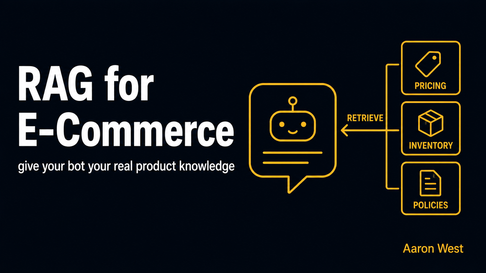
RAG Explained for E-Commerce: Giving a Bot Your Product Knowledge Without Retraining It
If you want an AI assistant that actually knows your store, your real products, your current prices, your live stock, your specific return policy, the technique you need is RAG, retrieval-augmented generation. It connects the AI to your live business data so it answers from…
Continue reading...
Why Most Chatbot Projects Fail Before a Single Line of Code
Most chatbot projects are lost before anyone opens a tool. By the time the building starts, the decisions that decide success or failure, what the bot is for, what it will handle, how it will be measured, who will maintain it, have usually already been…
Continue reading...