Accessibility: The Legal Case, the Moral Case, and the Conversion Case

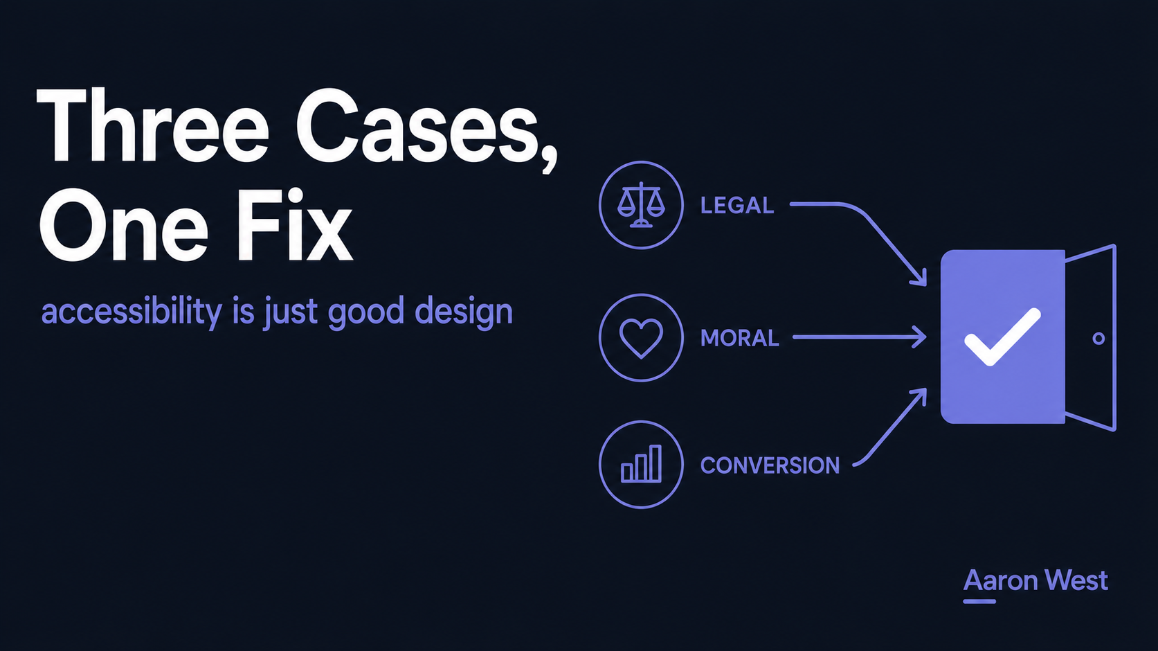
Table of Contents
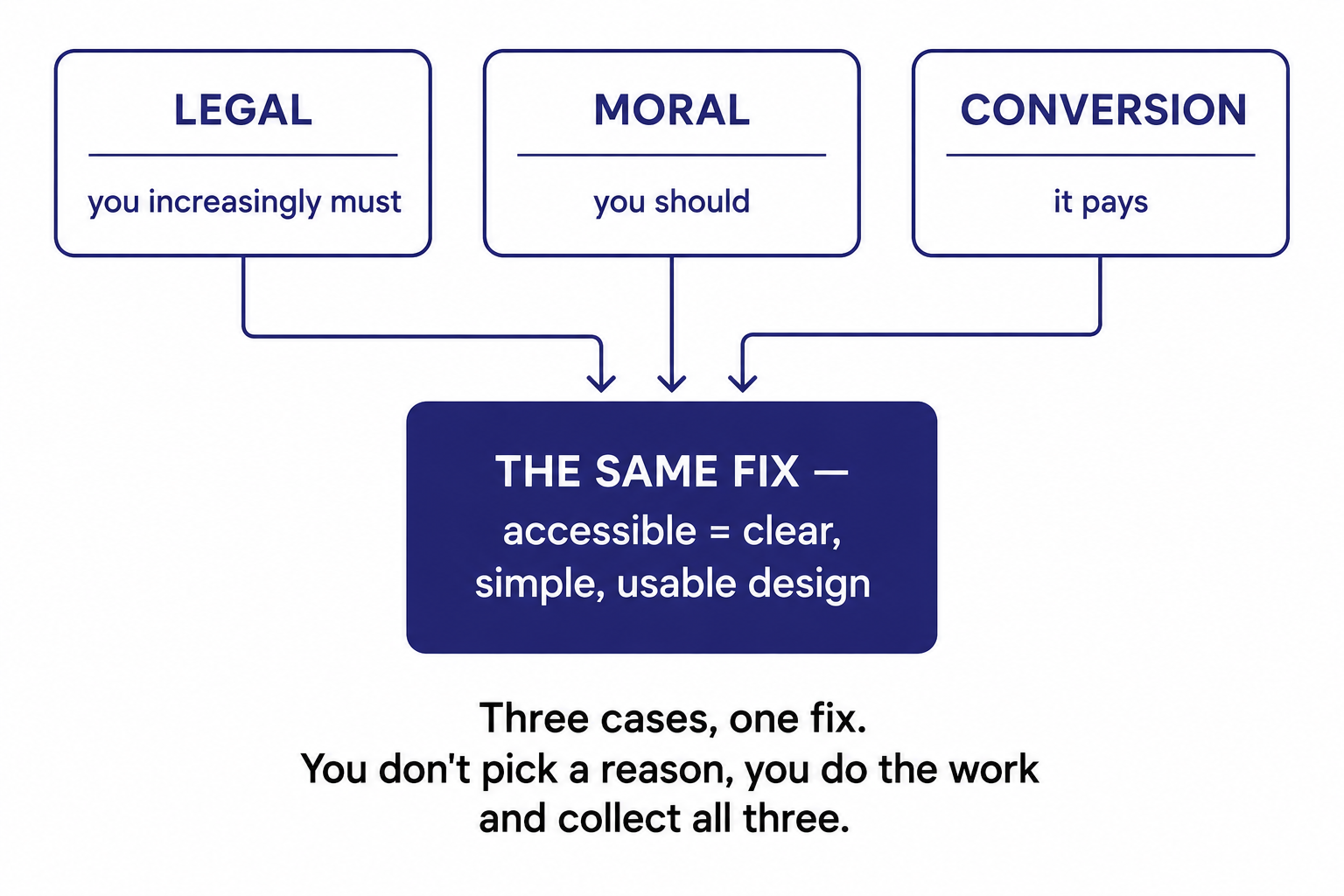
Accessibility is usually argued three ways: the legal case (you increasingly must), the moral case (you should), and the conversion case (it pays). The mistake is treating them as competing reasons and picking one. They're the same fix seen from three angles: making your store usable by everyone is right, increasingly required by law, and converts better, because the barriers that exclude disabled users quietly cost you sales from everyone else too.
This is a core of the Data, Privacy & Compliance pillar, under the cornerstone that the trust layer sits under everything, accessibility is part of treating customers, all of them, with respect. A note on the legal section below: it's directional, not legal advice. For your obligations, get qualified counsel.
Three cases, treated as a contest
Walk into most discussions about accessibility and you'll find teams picking a lane. The compliance people argue the legal case (regulations require it). The values-driven people argue the moral case (excluding disabled people is wrong). The growth people argue the conversion case (accessible stores sell more). Then they debate which reason should win the budget.
That debate is the mistake, because the three cases aren't competing arguments for different actions. They're three lenses on the same action: making your store usable by everyone. You don't have to decide which reason matters most. You do the work, and you collect all three benefits at once. Understanding that is what gets accessibility out of the "nice to have, maybe next quarter" pile.
The legal case (briefly, and not legal advice)
Accessibility requirements for digital storefronts are tightening in many markets, and "we didn't think about it" is an increasingly weak and risky position to be caught in. That's about as specific as this piece should get, because the details vary by market and change over time, and this isn't legal advice. For what actually applies to you, get qualified counsel and check the current rules in your markets. The takeaway for now is directional: the legal floor under accessibility is rising, not falling, and treating it as optional is a bet that's getting worse with time.
The moral case (briefly, and honestly)
A meaningful share of people have a disability that affects how they use the web, whether that's sight, motor control, hearing, or cognition. An inaccessible store tells all of them, in effect, that they're not welcome to buy from you, not by intention, but by neglect. For a lot of people that's reason enough, and it should be. Excluding people because you didn't think about them isn't neutral.
But here's the convenient part, and it's the bridge to the argument that actually moves budgets: the moral case isn't the only case, and it points at exactly the same work as the one that does move them.
The conversion case (the one that gets it funded)
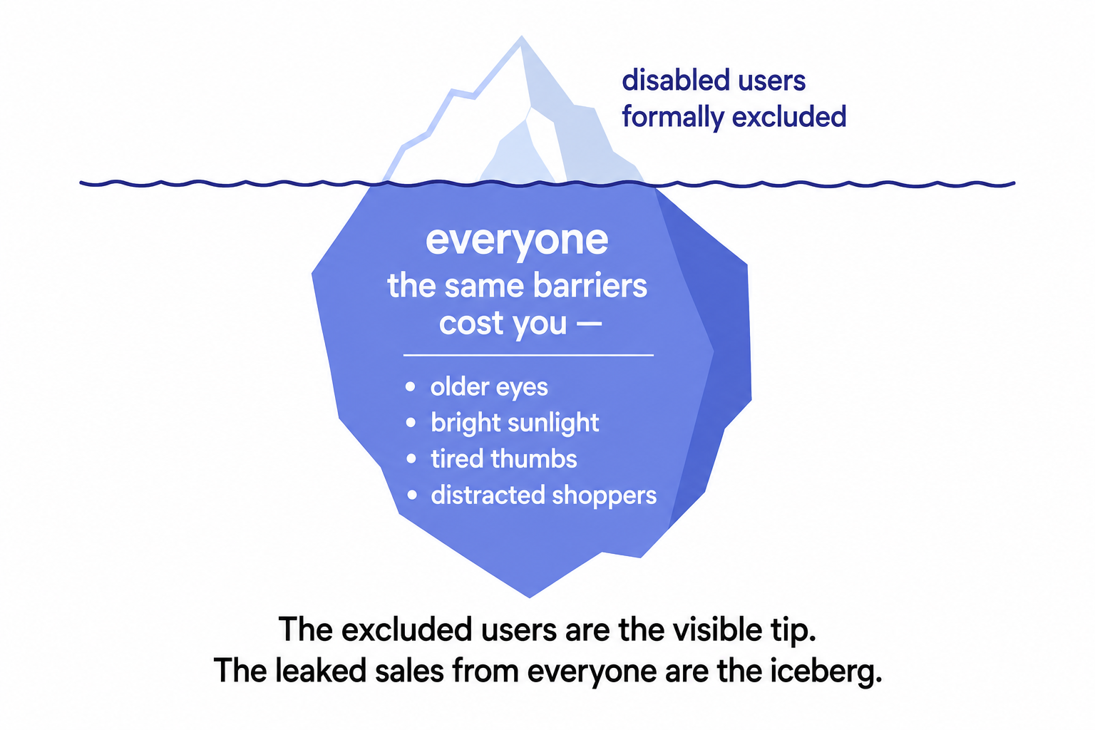
This is the practitioner's lever, so it's worth being precise about the mechanism. The barriers that lock disabled users out, poor colour contrast, tiny tap targets, unclear labels, keyboard traps, confusing structure, unreadable forms, don't only affect disabled users. They quietly degrade the experience for everyone:
- The older customer whose eyes the low-contrast text defeats.
- The person shopping in bright sunlight who can't read the pale grey labels.
- The tired thumb on a phone that keeps missing the too-small button, the mobile reality.
- The distracted shopper who gives up on a confusing, poorly-structured checkout.
Every one of those is a non-disabled customer that an "accessibility" barrier just cost you. Which means accessible design isn't a special accommodation for a minority, it's clearer, simpler, faster design that lifts conversion across your whole audience. Fixing it doesn't just serve disabled users; it recovers sales you were leaking from everyone.
Why they're the same fix
Look at what good accessible design actually is, and the unity becomes obvious. It's clear colour contrast, legible text, sensible page structure, proper labels, keyboard usability, no traps, clear forms and error messages. Now look at what good UX is. It's the same list. Accessible design and good design are, to a very large degree, the same thing, which is why the legal requirement, the moral imperative, and the conversion lift all point at the identical work.
This is the conversion and UX discipline and the mobile usability discipline, viewed through the accessibility lens. Proper labels and structure even help machines read your pages, tying into structured, well-organised content. You're not doing three jobs. You're doing one job that happens to satisfy three different demands.
Built in, not bolted on
The one practical warning: accessibility done as a last-minute compliance audit bolted onto a finished store is painful, expensive, and shallow, you end up patching symptoms. Built in as a design posture, clear, simple, usable by everyone, from the start, it's cheaper, deeper, and it improves the store for all users as a matter of course. It's not a checkbox you tick at the end; it's a way of designing.
The practical starting points are unglamorous and familiar, because they're just good design: readable contrast and text, proper labels and structure, keyboard navigability, tap targets sized for real thumbs, and clear forms and error messages at the checkout. Not an exhaustive audit, the posture is simply "usable by everyone," and most of the wins follow from holding that posture rather than from a one-off remediation sprint.
What this comes down to
Accessibility isn't a legal box, a moral nicety, or a conversion tactic, weighed against each other. It's all three at once, because they're the same fix seen from three angles. Making your store usable by everyone is right, increasingly required, and more profitable, since the barriers that exclude disabled customers quietly cost you sales from everyone else: the older eyes, the sunlit screen, the tired thumb, the distracted shopper.
So stop debating which reason should win the budget. The conversion case is what gets accessibility funded, which is a little cynical and entirely true, "it's the law" and "it's right" lose budget arguments to "it's costing us sales," and happily, inaccessibility costs you sales from far more people than it formally excludes. The store that welcomes everyone is the store that sells to everyone. That's not a coincidence. It's the whole point. (For your legal obligations specifically, get qualified counsel, this isn't legal advice.)
A few common questions
Why should an e-commerce store invest in accessibility? Because the usual three reasons aren't competing, they're the same fix from three angles. It's increasingly required by law, it's the right thing (a meaningful share of people have a disability affecting how they use the web), and it converts better. The barriers that exclude disabled users, poor contrast, tiny targets, unclear labels, confusing structure, also degrade the experience for everyone else, so fixing them lifts conversion across your whole audience. You don't pick a reason; you do the work and collect all three benefits.
How does accessibility actually improve conversion? The barriers that lock disabled users out also quietly cost you sales from non-disabled customers: the older customer defeated by low-contrast text, the person in bright sunlight who can't read pale labels, the tired thumb missing a too-small button, the distracted shopper giving up on a confusing checkout. Accessible design is clearer, simpler, faster design, so removing those barriers recovers sales you were leaking from everyone, not just the disabled users it formally excludes. The excluded users are the visible tip; the leaked sales are the iceberg.
Is accessibility the same as good UX? To a very large degree, yes. Good accessible design, clear contrast, legible text, sensible structure, proper labels, keyboard usability, clear forms, is essentially the same list as good UX. That's exactly why the legal, moral, and conversion cases all point at the identical work: you're not doing three jobs, you're doing one job that happens to satisfy three demands. It's best built in as a design posture from the start rather than bolted on as a last-minute compliance audit, which is painful, expensive, and shallow.
What's the difference between building accessibility in and bolting it on? Bolting it on means treating accessibility as a last-minute compliance audit on a finished store, you patch symptoms, it's expensive, and it stays shallow. Building it in means designing for "usable by everyone" from the start, clear contrast and text, proper labels and structure, keyboard navigability, properly sized tap targets, clear forms, which is cheaper, deeper, and improves the store for all users as a matter of course. The posture, not the audit, is what delivers the legal, moral, and conversion benefits together.
You should also read:
The Zero-Results Page Is a Conversion Opportunity, Not a Dead End
A zero-results page, the cold "no results found" a customer hits when their search or filter returns nothing, is one of the most under-designed pages in e-commerce and one of the most costly. The customer just told you, with high intent, exactly what they wanted,…
Continue reading...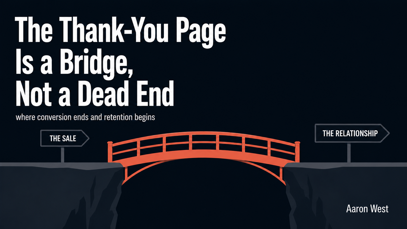
The Thank-You Page: Where Conversion Ends and Retention Begins
The moment right after someone buys from you is the single highest-trust, highest-goodwill moment you will ever get with that person. They have just said yes. They have handed over their card, their email, their address. Their guard is down and their momentum is forward.
Continue reading...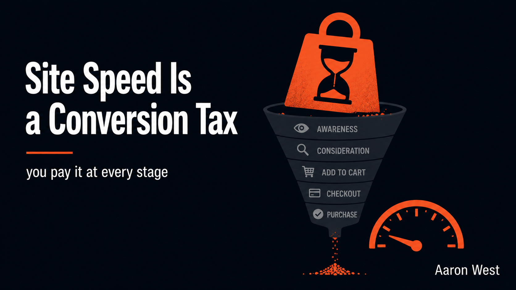
Site Speed Is a Conversion Tax You Pay at Every Stage
Site speed is not a separate conversion problem you can deal with later. It is a tax applied to every stage of your funnel at once, quietly shrinking the result of all the other work you do. A slow site loses people at discovery before…
Continue reading...