Mobile Is Most of Your Traffic, and You're Still Designing for Desktop

Table of Contents
For most e-commerce, mobile is now the majority of traffic, and yet most stores are still designed, reviewed, and decided on desktop by teams sitting at large screens. That gap, the experience most customers actually have being the one the business looks at least, is where a large share of lost sales quietly hides. Mobile-first isn't a responsive-design checkbox. It's the discipline of designing and deciding for the small screen and the on-the-go context first, because that's where your customers and your problems actually are.
This opens the Mobile & App Commerce pillar, and it's the cornerstone the cluster links up to: the UX patterns that convert on a small screen, the question of whether you need an app at all, and mobile payments and one-tap checkout. All of it rests on one uncomfortable observation about who designs the mobile experience and who actually uses it.
The mismatch nobody quite owns
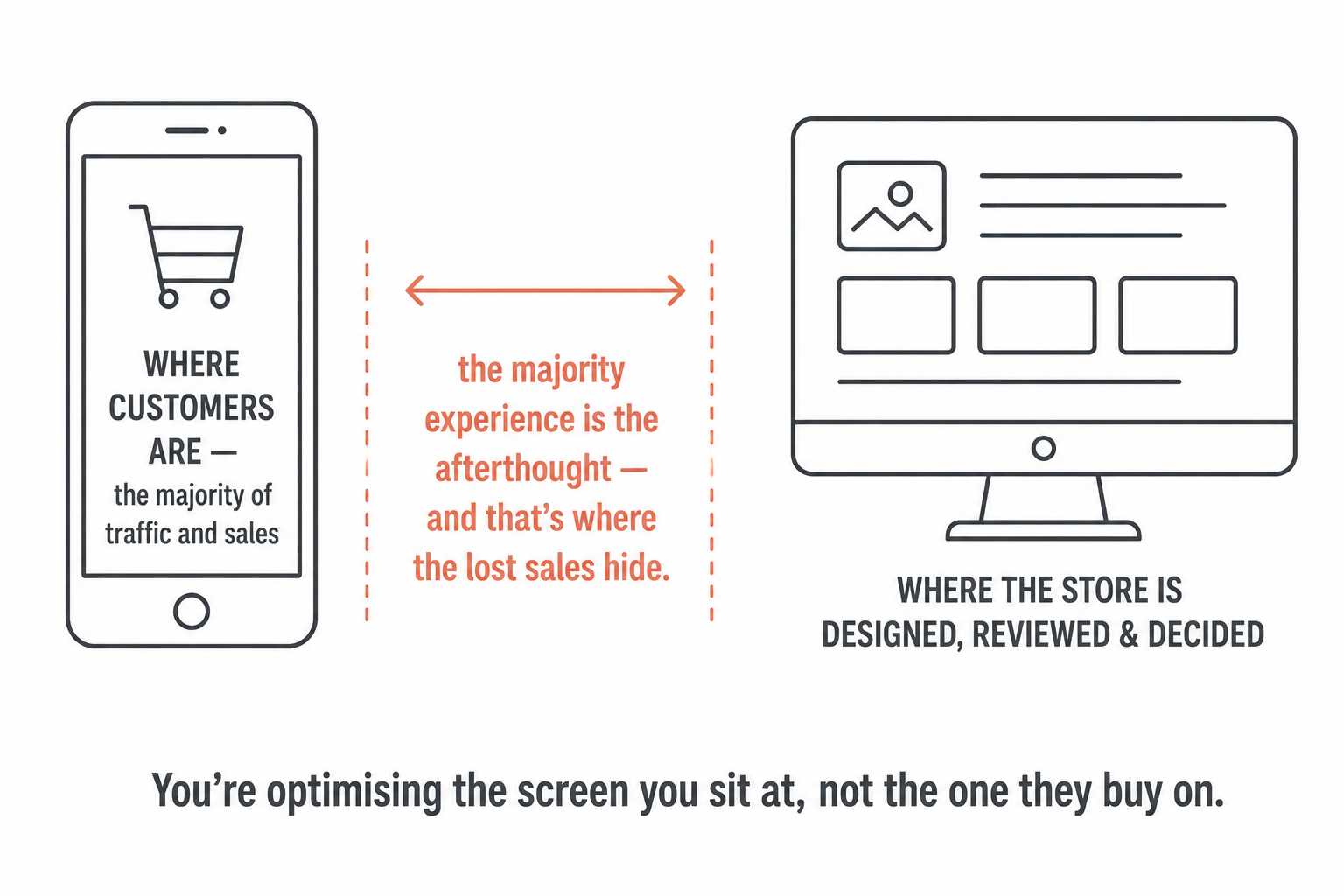
Here's the mismatch. For most stores, the majority of customers arrive, browse, and increasingly buy on a phone. But the people building the store, designers, marketers, managers, work on desktops. They design on a big screen, demo on a big screen, and judge whether it's good on a big screen. The "approve the new page" meeting happens on a laptop, not a phone on a train with one bar of signal.
So the experience the majority of customers actually have is the one the business spends the least real time inside. The desktop version gets the scrutiny because that's where the team lives; the mobile version gets a glance and a "looks fine, it's responsive." The customer's reality and the team's reality have quietly diverged, and the bigger the gap, the more sales leak out of it without anyone watching the right screen to notice.
Mobile converts worse, and everyone shrugs
There's a number behind the mismatch that almost every store knows and almost none acts on: mobile typically converts worse than desktop. Same store, same products, fewer of the mobile visitors turn into buyers. And the near-universal response is a shrug, of course it does, small screen, people are on the go, that's just how mobile is.
That shrug is the most expensive assumption in e-commerce. The mobile conversion gap is treated as a fact of nature, when it's mostly friction you can fix: slow-loading heavy pages, forms that are agony to type on a phone, primary buttons buried below the fold, tap targets too small to hit cleanly, navigation built for a cursor. None of that is inherent to mobile; it's inherited from designing for desktop and reflowing down. Treating the gap as inevitable means leaving the single biggest conversion opportunity in the building untouched, on the channel that carries the most traffic. The gap is not a law. It's a to-do list nobody opened.
Why mobile genuinely is harder
To be fair to the shrug, mobile is harder, and pretending otherwise leads to lazy fixes. The constraints are real:
- The screen is small, so every element competes for space and you can't show everything at once the way a desktop layout can.
- The input is a thumb, not a cursor. Touch is less precise, there's no hover, and fat fingers hit the wrong target when things are crowded.
- The context is distracted and on the move. People shop on mobile in queues, on trains, between tasks, interrupted, with less patience and a lower tolerance for anything that makes them stop and think.
- The connection is variable, so a heavy page that loads instantly on office wifi can stall on mobile data, and a stalled page is an abandoned one.
- Typing is painful, which turns every form field into real friction in a way it never is with a keyboard.
These are genuine, and they're exactly why a desktop experience reflowed onto a phone fails: it ignores every one of them. But naming them correctly is what turns them from excuses into a design brief. Each constraint points at a fix, and the rest of this cluster is those fixes.
Mobile-first is a discipline, not a layout
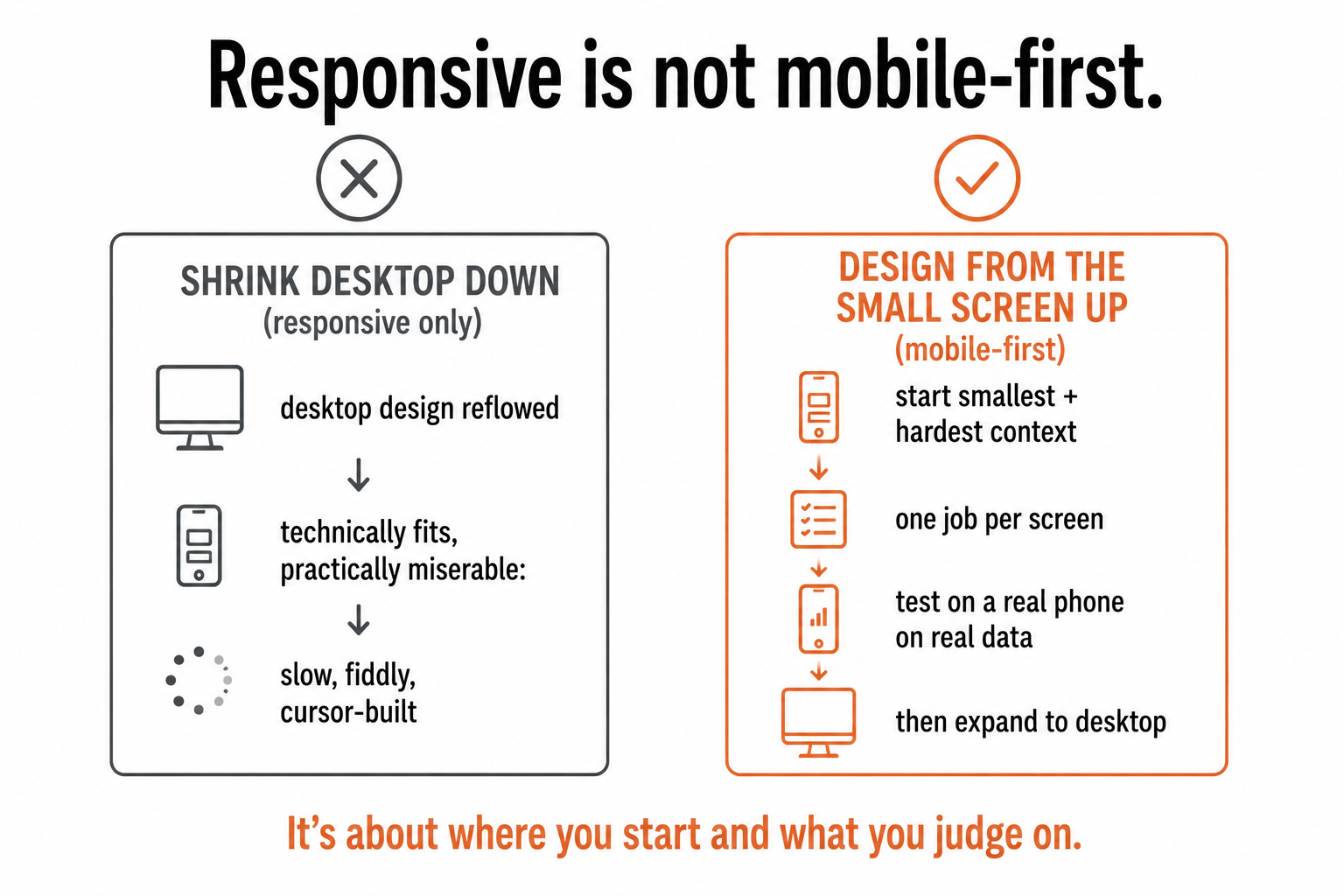
This is the part that matters most, because it's where most teams think they've done the work when they haven't. "We're responsive" is where the effort usually stops, and responsive design, the layout reflowing to fit the screen, is necessary but nowhere near sufficient. A perfectly responsive site can still be a miserable mobile experience: technically it fits, practically it's slow, fiddly, and built for a cursor.
Mobile-first means three concrete things, and none of them is about breakpoints:
- Design from the smallest screen and hardest context first, then expand to desktop, rather than designing for desktop and shrinking down. Starting small forces you to decide what genuinely matters, because there's no room for anything else.
- Decide priority on mobile. Each screen gets one primary job and one primary action, because that's all a small screen can carry well. The discipline of "what is the one thing this screen must do" makes the desktop version better too.
- Review and test on real phones, on real connections. Not the desktop browser resized to a narrow window, an actual phone, on mobile data, in a distracted moment. The bugs and the friction only show up there, which is exactly why the desktop-approval meeting misses them.
The shift isn't technical. It's about where you start and what you judge on.
It's the context, not just the screen size
One deeper point, because it's the thing responsive design can never fix. Mobile isn't just a smaller desktop; it's a different context. The person is more likely distracted, interrupted, moving, short on patience, and, crucially, warier about entering card details on a phone on the go than they'd be at a desk. A layout that merely reflows treats mobile as a resolution problem. Designing mobile-first treats it as a context problem: shorter attention, lower trust, less patience, more interruption, and builds for that reality, which is why it asks for fewer steps, less typing, faster loads, and clearer trust cues at the moment a card comes out. The screen size is the obvious constraint. The context is the one that actually decides whether the sale happens.
What this comes down to
Mobile is where most of your customers are and where most of your conversion is being lost, and the reason it's lost is mundane: the experience is built and judged by people on desktops, and the gap is written off as the way mobile is. It isn't the way mobile is. It's the way desktop-designed mobile is.
Mobile-first isn't a layout that reflows; it's the discipline of starting from the hardest screen and the most distracted context, deciding one job per screen, and testing on a real phone on a real connection before you call it done. The cores of this cluster, the UX patterns, the app question, the payment moment, are all that discipline applied. But the cornerstone is the mindset: until the majority experience is the one you design first and judge hardest, you're optimising for the minority and calling the rest inevitable. It was never inevitable. You were just looking at the wrong screen.
A few common questions
Is mobile really the majority of e-commerce traffic? For most stores, yes, the majority of visitors now arrive, browse, and increasingly buy on a phone. The problem is that the people who design, review, and approve the store work on desktops, so the experience the majority of customers actually have is the one the business spends the least time inside. The desktop version gets the scrutiny; the mobile version gets a glance and a "looks fine, it's responsive," which is exactly where a large share of lost sales hides.
Why does mobile convert worse than desktop? Partly because mobile genuinely is harder, small screen, imprecise touch input, a distracted on-the-go context, variable connection, and painful typing, and partly because most mobile experiences are desktop designs reflowed down rather than built for those constraints. The key point is that the gap is mostly fixable friction (slow pages, agonising forms, buried buttons, tiny tap targets), not a law of nature. Treating it as inevitable leaves the single biggest conversion opportunity in the building untouched, on the channel with the most traffic.
What does "mobile-first" actually mean? Not just a responsive layout. It means three things: designing from the smallest screen and hardest context first (then expanding to desktop, rather than shrinking desktop down), deciding priority on mobile so each screen has one primary job and one primary action, and reviewing and testing on real phones on real connections rather than a resized desktop browser. Responsive design is necessary but not sufficient, a perfectly responsive site can still be a miserable mobile experience. Mobile-first is about where you start and what you judge on.
Isn't mobile just a smaller version of the desktop site? No, and that's the assumption that causes the damage. Mobile is a different context, not just a smaller screen: the customer is more likely distracted, interrupted, moving, short on patience, and warier about entering card details on the go. A layout that merely reflows treats mobile as a resolution problem; designing mobile-first treats it as a context problem and builds for shorter attention, lower trust, and less patience, with fewer steps, less typing, faster loads, and clearer trust cues. The context, not the screen size, is what decides whether the sale happens.
You should also read:
Mobile Payments and One-Tap Checkout
On mobile, the payment step is where conversion is most often won or lost, because entering card details by hand on a phone is the single most painful moment in the entire purchase, and one-tap digital wallets are the fix. The mobile checkout problem is…
Continue reading...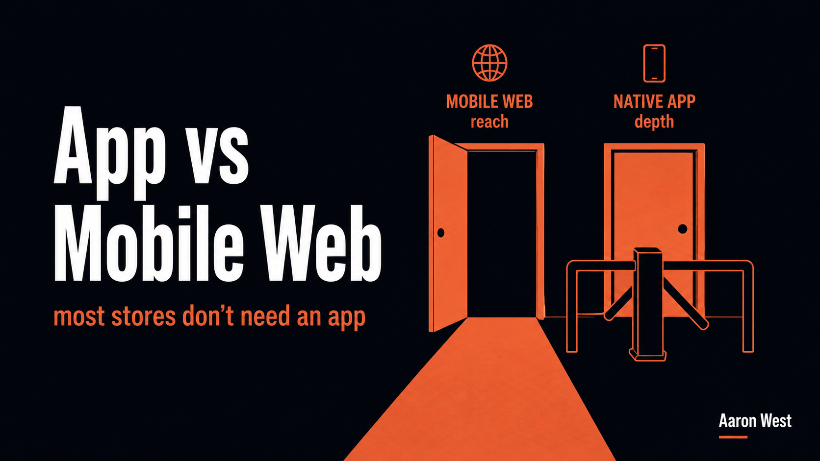
App vs Mobile Web: When an App Is Actually Worth It
Most e-commerce stores don't need a native app, and building one is one of the most expensive mistakes in mobile commerce, because an app isn't "mobile done properly." It's a separate product, with a separate build, permanent maintenance, and a brutal install barrier. The real…
Continue reading...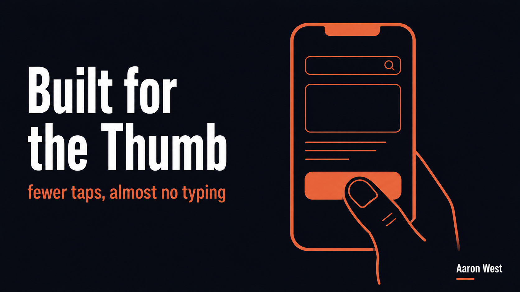
Mobile UX: The Patterns That Convert on a Small Screen
Mobile UX is not desktop design shrunk to fit. It's a distinct set of patterns built around the thumb, the small screen, and a distracted, on-the-go customer. The patterns that convert all share one logic: reduce the effort, especially typing and tapping, required to get…
Continue reading...