Mobile UX: The Patterns That Convert on a Small Screen

Table of Contents
Mobile UX is not desktop design shrunk to fit. It's a distinct set of patterns built around the thumb, the small screen, and a distracted, on-the-go customer. The patterns that convert all share one logic: reduce the effort, especially typing and tapping, required to get from intent to purchase on a device where every extra step, every mistyped field, and every slow-loading image costs you the sale. Get those patterns right and you close most of the mobile conversion gap that teams treat as inevitable.
This is a core of the Mobile & App Commerce pillar, under the cornerstone that mobile is the majority but designed for desktop. The cornerstone argued the gap is fixable friction, not a law of nature. This piece is the friction, named pattern by pattern.
The one lens for all of it
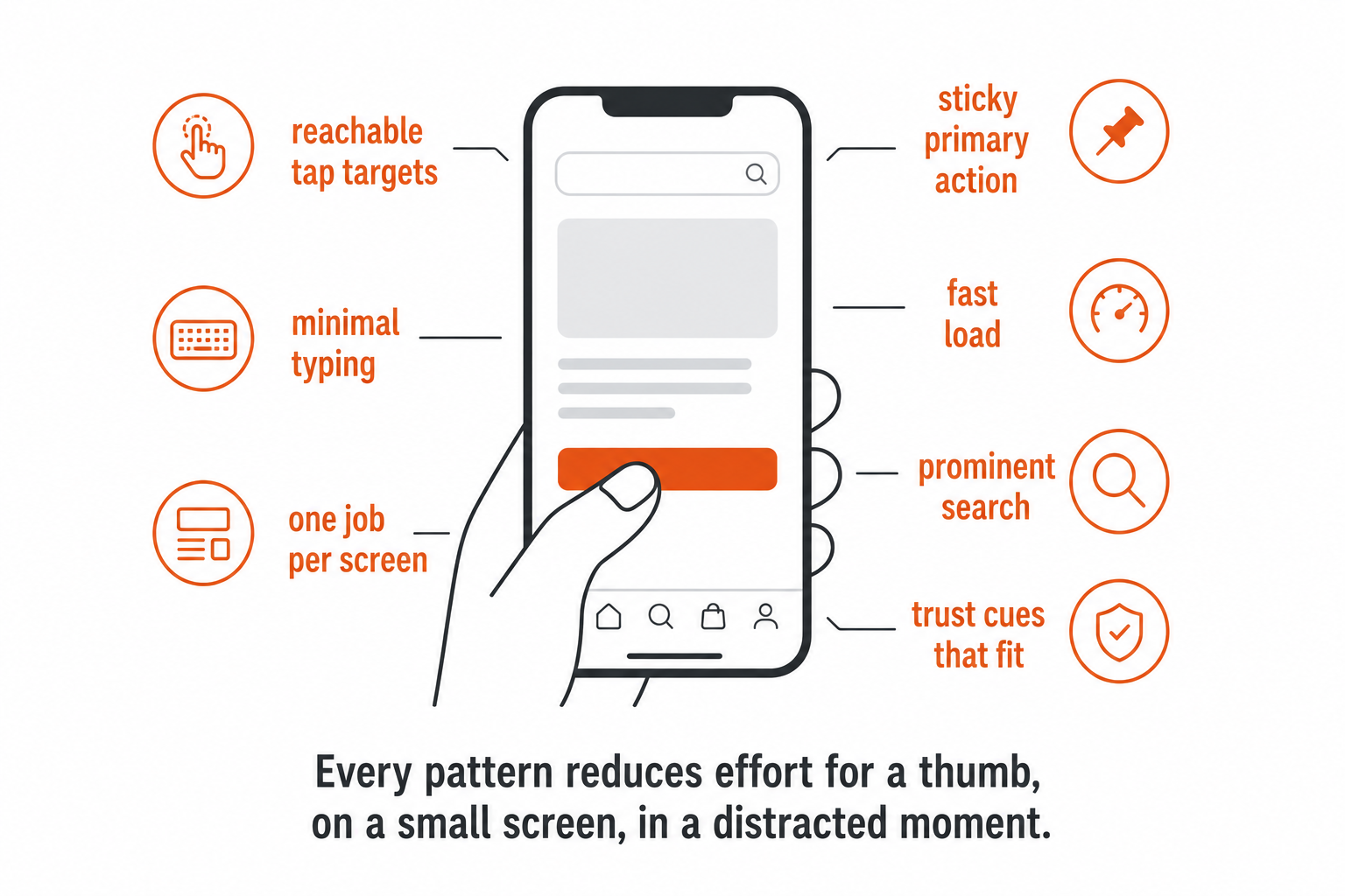
Before the patterns, the lens that ties them together, because it's more useful than any individual tip: every good mobile pattern reduces the effort for a thumb, on a small screen, in a distracted moment, to get from "I want this" to "I bought it." Tapping and typing are the two costliest actions on a phone, so the patterns that move conversion are the ones that minimise both. Hold that lens up to any mobile design decision and the right answer usually falls out.
Reachability and tap targets
The input on mobile is a thumb, not a cursor, and that changes everything about where things go and how big they are. Primary actions belong within easy thumb reach, not stranded in a top corner that requires a hand-shuffle to reach. Buttons need to be big enough to hit confidently, with enough spacing that a slightly-off tap doesn't trigger the wrong thing. Crowded, tiny targets produce mis-taps, and a mis-tap on mobile is friction and frustration in one, the customer wanted to add to cart and instead opened a menu, and some share of them just leave. Designing for the thumb is the most basic mobile pattern and one of the most commonly botched, because it looks fine on the designer's big screen where a precise cursor never mis-clicks.
Minimise typing: the form is the enemy
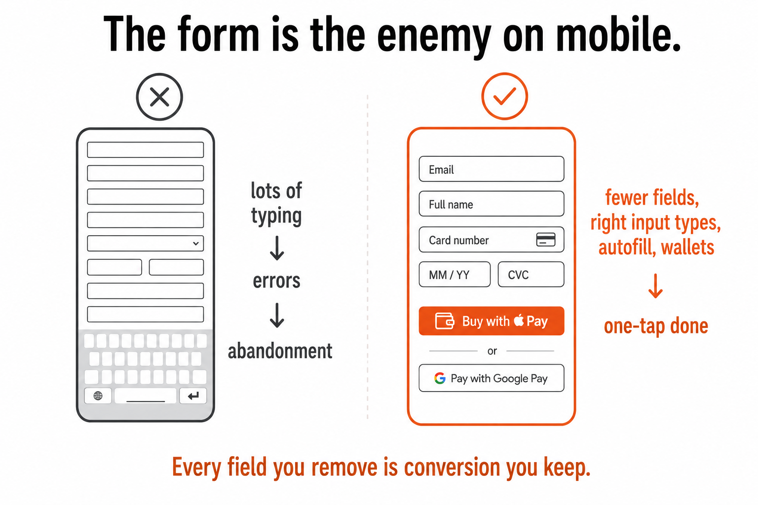
If there's one mobile pattern that matters more than the rest, it's this: typing on a phone is slow, awkward, and error-prone, so every form field is real friction, and the form is the single biggest conversion killer on mobile. The patterns all push the same way, ask for less and type less:
- Cut fields ruthlessly. Every field you remove is conversion you keep. If you don't truly need it to complete the order, it shouldn't be there.
- Use the right input types. A numeric keypad for number fields, the right keyboard for email, so the customer isn't fighting the wrong layout.
- Lean on autofill and address lookup, so the phone and the browser do the typing the customer would otherwise do badly.
- Offer wallets that skip typing entirely. A wallet that fills name, address, and card in one authenticated tap removes the most painful part of a mobile checkout, which is exactly why it's a core of the mobile-payments piece and the checkout-friction work.
On desktop a long form is an annoyance. On mobile it's a wall, and the stores that win on mobile are the ones that made the wall as short as possible.
One job per screen, and a path that's always there
A small screen can't show everything at once, so the desktop instinct to put it all on the page works against you. The mobile pattern is ruthless prioritisation: each screen has one primary job and one primary action, stacked in a single column, leading with what matters most. Where desktop says "show everything," mobile says "show the next right thing."
And because mobile pages are long and scrolled with a thumb, the primary action shouldn't disappear up the screen as the customer reads. Keeping the key action, add to cart, proceed to checkout, along with the price, persistent and visible as they scroll means the path forward is always one tap away rather than a frustrated scroll back up to find it. A buried "buy" button on a long mobile page is a sale left waiting for effort the customer won't spend.
Speed is a UX pattern on mobile
On mobile, speed isn't a technical nicety sitting behind the design; it is part of the experience. Mobile connections are slower and less stable than office wifi, so a heavy page that loads instantly for the designer can stall for the customer on mobile data, and a stalled page is an abandoned one before any clever UX gets a chance to work. That's why lightweight pages and fast-loading, properly sized images matter more on mobile than anywhere else, and why this pattern ties straight to the image-and-speed work on the infrastructure side. On mobile, speed is conversion, and it's the pattern most likely to be undone by a marketing team adding one more heavy hero image.
Navigation, search, and trust, sized for the screen
Three more patterns the cores around this one go deeper on:
- Navigation has to shrink without breaking. The desktop mega-menu doesn't fit a phone, so mobile needs simplified, well-structured navigation, and crucially a prominent, forgiving search, because search is how mobile users cut through when browsing is harder on a small screen. On mobile, search isn't a fallback; it's often the main road.
- Trust cues have to work small. Entering card details on a phone, often on the go, takes more trust than at a desk, and the trust signals that reassure have to be legible and present on a small screen at the payment moment, not crammed off-screen.
- Wallets do double duty, removing typing and carrying their own familiar trust, which is why they're disproportionately powerful on mobile.
What this comes down to
Most "mobile optimisation" is cosmetic, a hamburger menu, columns that reflow, and it leaves the actual conversion killers untouched: the typing, the slow loads, the buried primary actions, the tap targets too small to hit. The patterns that genuinely move mobile conversion are unglamorous and specific, and they all come back to the same lens, let a distracted thumb buy in as few taps and as little typing as possible.
Get them right, reachable actions, almost no typing, one job per screen, a path that's always one tap away, fast loads, search that works, trust cues that fit, and the "inevitable" mobile conversion gap mostly closes. Because it was never inevitable. It was just desktop design wearing a responsive layout, and the patterns above are what it looks like to actually design for the phone.
A few common questions
What's the single most important mobile UX pattern? Minimise typing. Typing on a phone is slow, awkward, and error-prone, so the form is the biggest conversion killer on mobile, and every field is real friction. Cut fields ruthlessly, use the right input types (numeric keypad for numbers, the right keyboard for email), lean on autofill and address lookup, and offer wallets that fill everything in one authenticated tap. On desktop a long form is an annoyance; on mobile it's a wall, and the stores that win made the wall as short as possible.
Why does speed matter more on mobile? Because mobile connections are slower and less stable than office wifi, so a heavy page that loads instantly for the designer can stall for the customer on mobile data, and a stalled page is abandoned before any clever UX gets to work. Lightweight pages and properly sized, fast-loading images matter more on mobile than anywhere else. On mobile, speed isn't a technical detail behind the design, it's part of the experience, and it's the pattern most easily undone by adding one more heavy image.
How should navigation and search differ on mobile? The desktop mega-menu doesn't fit a phone, so mobile needs simplified, well-structured navigation and, crucially, a prominent and forgiving search, because search is how mobile users cut through when browsing is harder on a small screen. On mobile, search is often the main road to a product, not a fallback, so it deserves prime placement and tolerance for typos and partial queries, not a tiny icon tucked in a corner.
Isn't responsive design enough for mobile? No. Responsive design (the layout reflowing to fit) is necessary but not sufficient, a perfectly responsive site can still be slow, fiddly, and built for a cursor. Mobile UX is a distinct set of patterns built for the thumb, the small screen, and a distracted context: reachable tap targets, minimal typing, one job per screen, a persistent primary action, fast loads, workable search, and trust cues that fit. The throughline is reducing the effort a distracted thumb needs to get from intent to purchase, which a reflowed desktop layout doesn't address.
You should also read:
Mobile Payments and One-Tap Checkout
On mobile, the payment step is where conversion is most often won or lost, because entering card details by hand on a phone is the single most painful moment in the entire purchase, and one-tap digital wallets are the fix. The mobile checkout problem is…
Continue reading...
App vs Mobile Web: When an App Is Actually Worth It
Most e-commerce stores don't need a native app, and building one is one of the most expensive mistakes in mobile commerce, because an app isn't "mobile done properly." It's a separate product, with a separate build, permanent maintenance, and a brutal install barrier. The real…
Continue reading...
Mobile Is Most of Your Traffic, and You're Still Designing for Desktop
For most e-commerce, mobile is now the majority of traffic, and yet most stores are still designed, reviewed, and decided on desktop by teams sitting at large screens. That gap, the experience most customers actually have being the one the business looks at least, is…
Continue reading...